[AT] Austria
Generic view
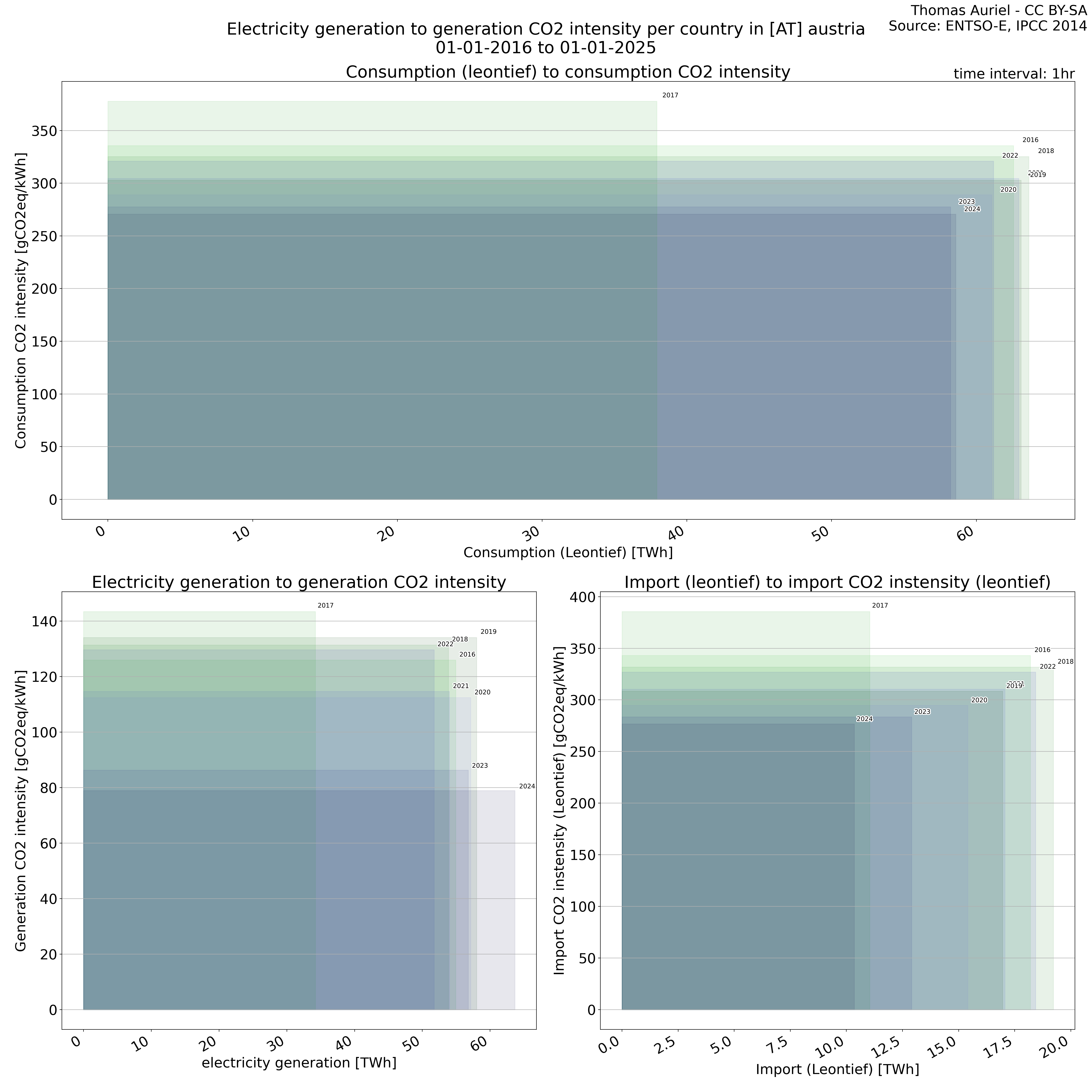
The plot consists of squares, each representing a single year, designed to illustrate electricity-related metrics and their associated environmental impacts. The length of each square corresponds to the total electricity consumption, generation, or imports during the year, with longer squares indicating higher overall values for the respective metric. The height of each square represents the average CO₂ intensity (e.g., grams of CO₂ per kWh) associated with electricity consumption, generation, or imports; hence, taller squares signify greater environmental impact per unit of electricity. Finally, the surface area of each square, determined by the product of its length and height, represents the total CO₂ emissions associated with the respective activity in the given year.
Evolution over years
The plot is divided into two sections, each representing distinct visualizations of electricity grid over time.
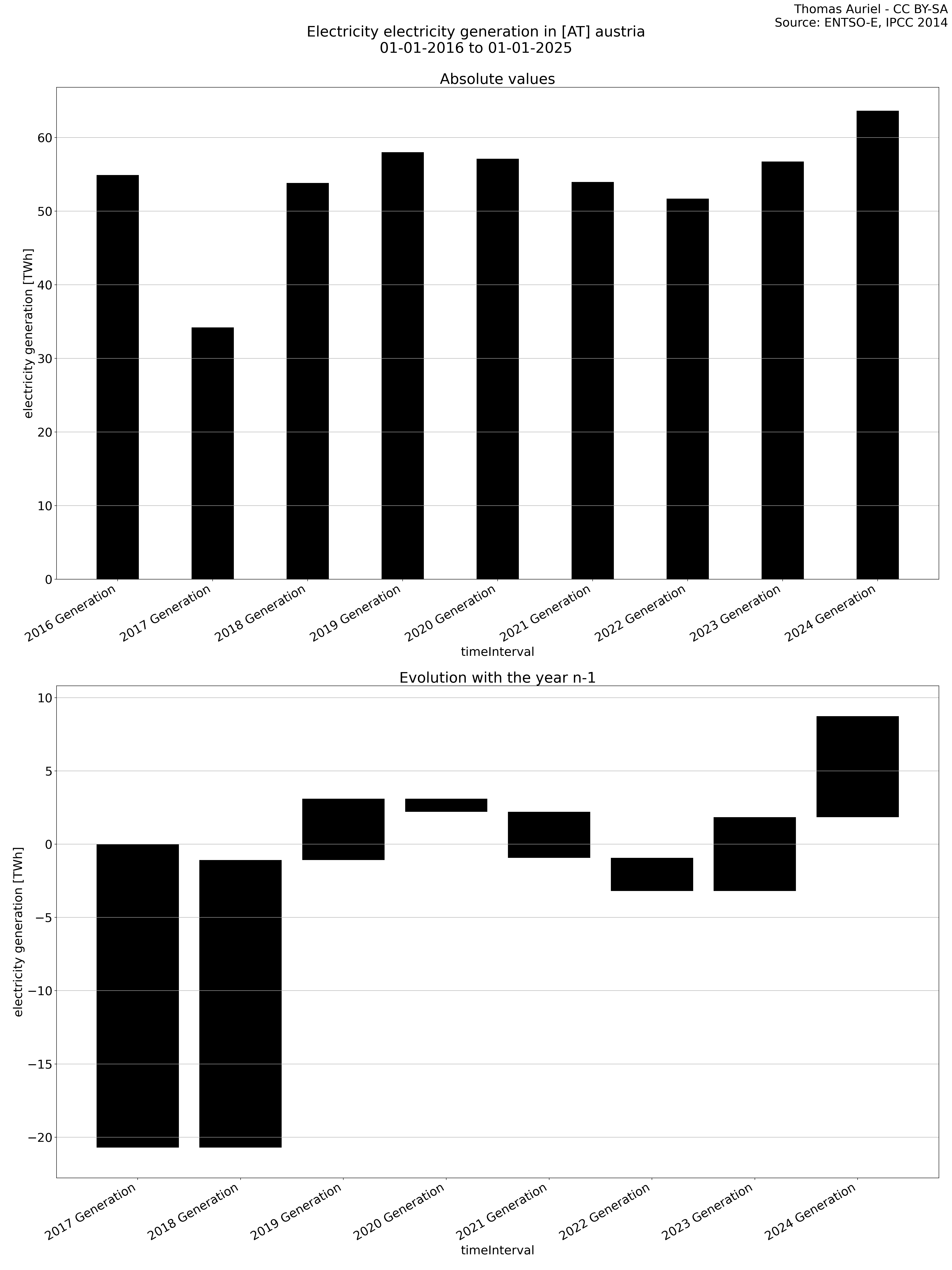
The first section consists of a bar plot. Each bar represents a specific electricity metric — such as production, generation, load, import, or export — over the course of a year. The bars are grouped by category, with each category further sorted by year. Therefore, this organization enables a clear comparison of the respective activities within each category across the years.
The second section features a waterfall graph, which visually represents the year-over-year changes in electricity metrics. In this graph, the length of each bar corresponds to the difference in the metric (e.g., production, load, etc.) compared to the previous year. Unlike the bar plot, the bars in the waterfall graph do not start at zero; instead, each bar begins where the previous one ended. Hence, this structure emphasizes the incremental changes in the metric over time, facilitating the visualization of fluctuations from one year to the next.
Together, these two visualizations provide complementary perspectives on the evolution of electricity activities, allowing for both absolute comparisons across years and a detailed focus on year-to-year variations.
Generation
Load
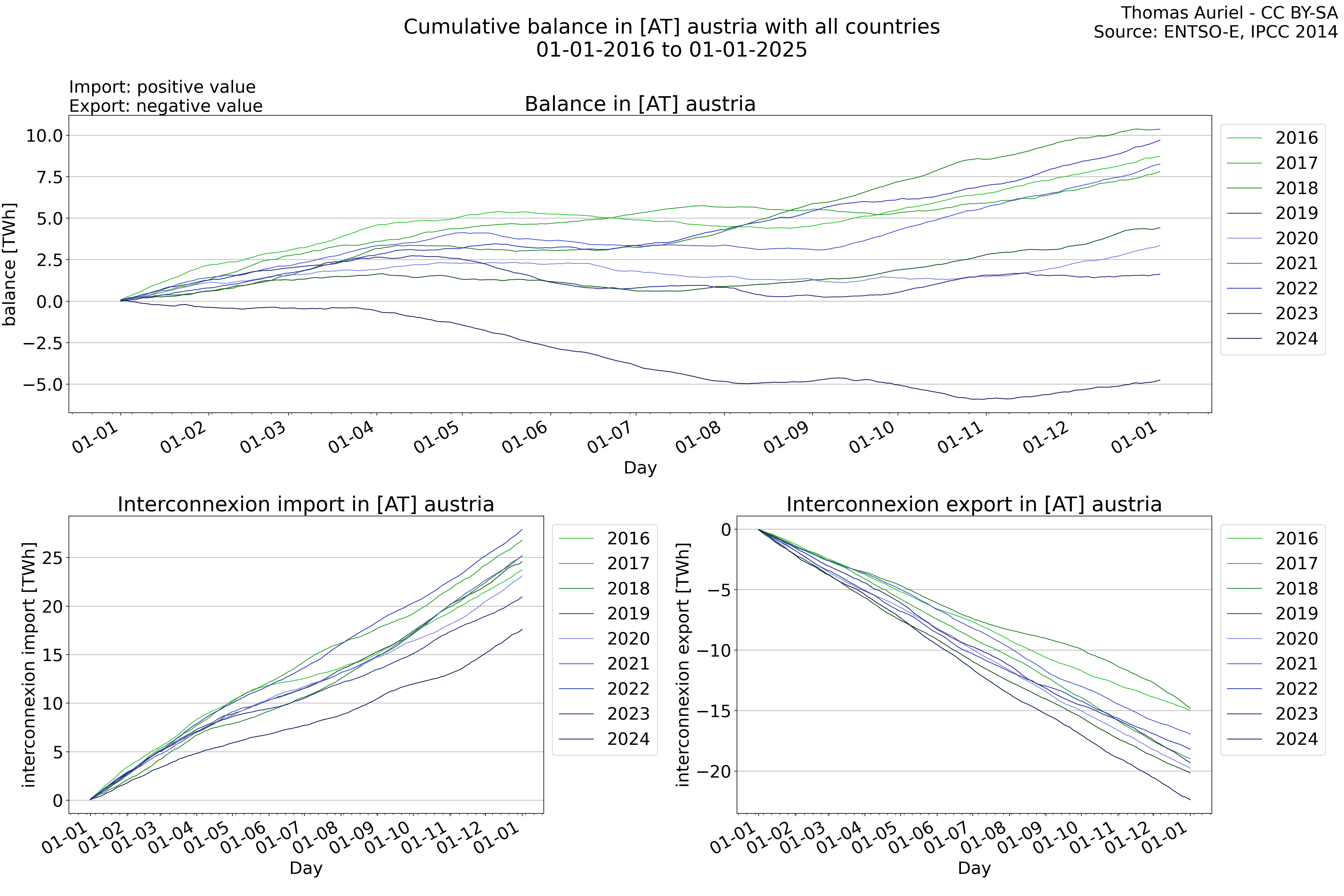
Balance
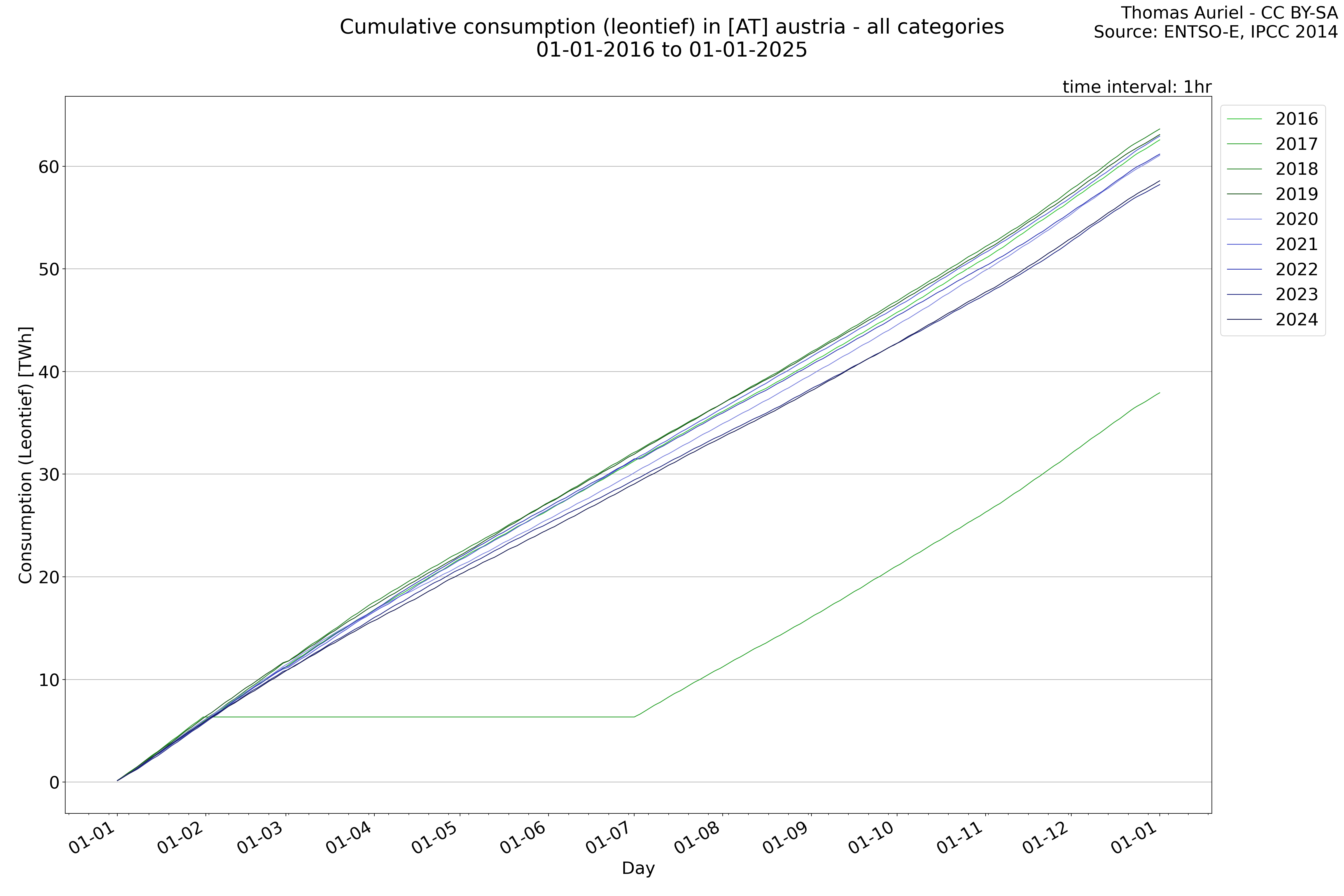
Consumption
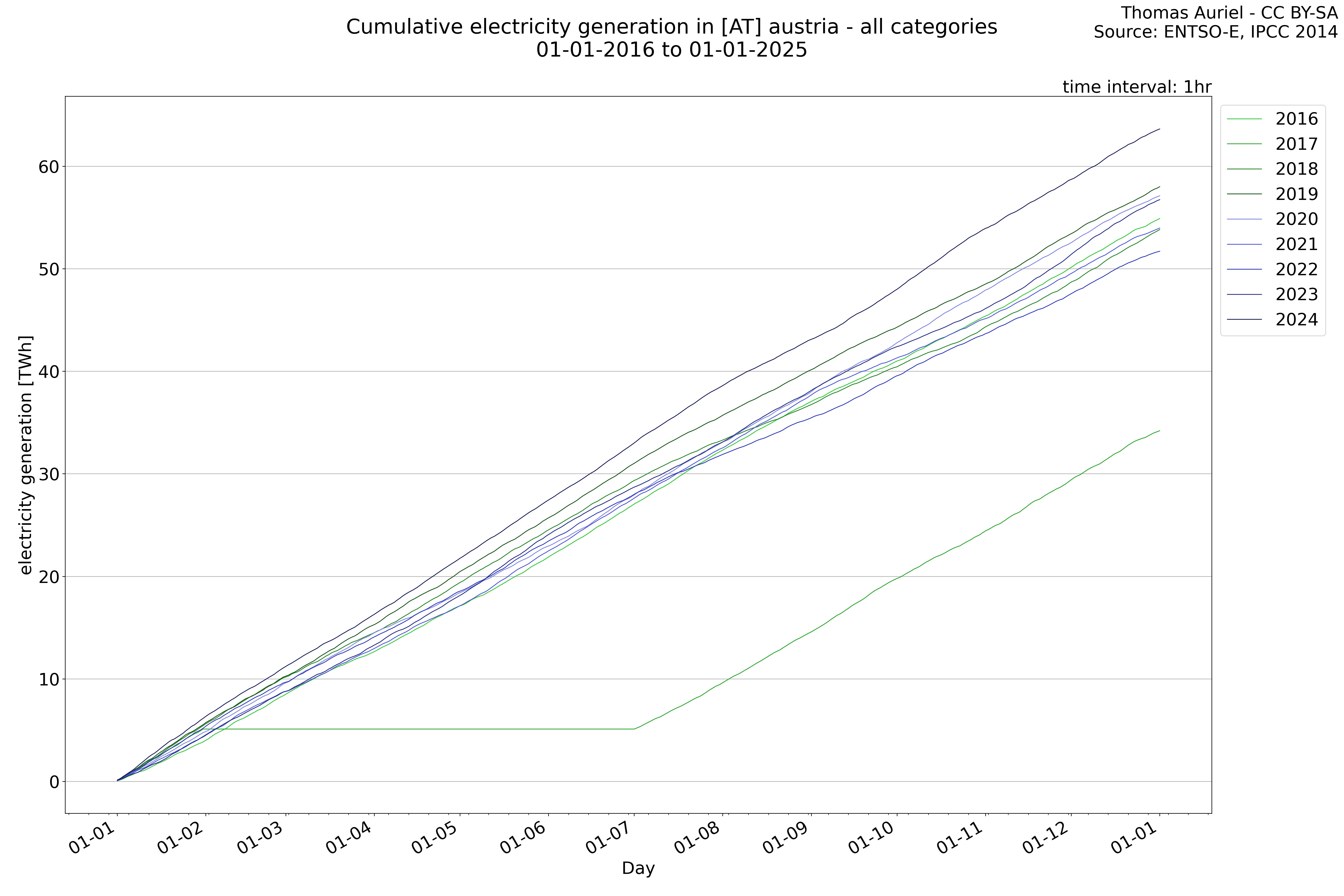
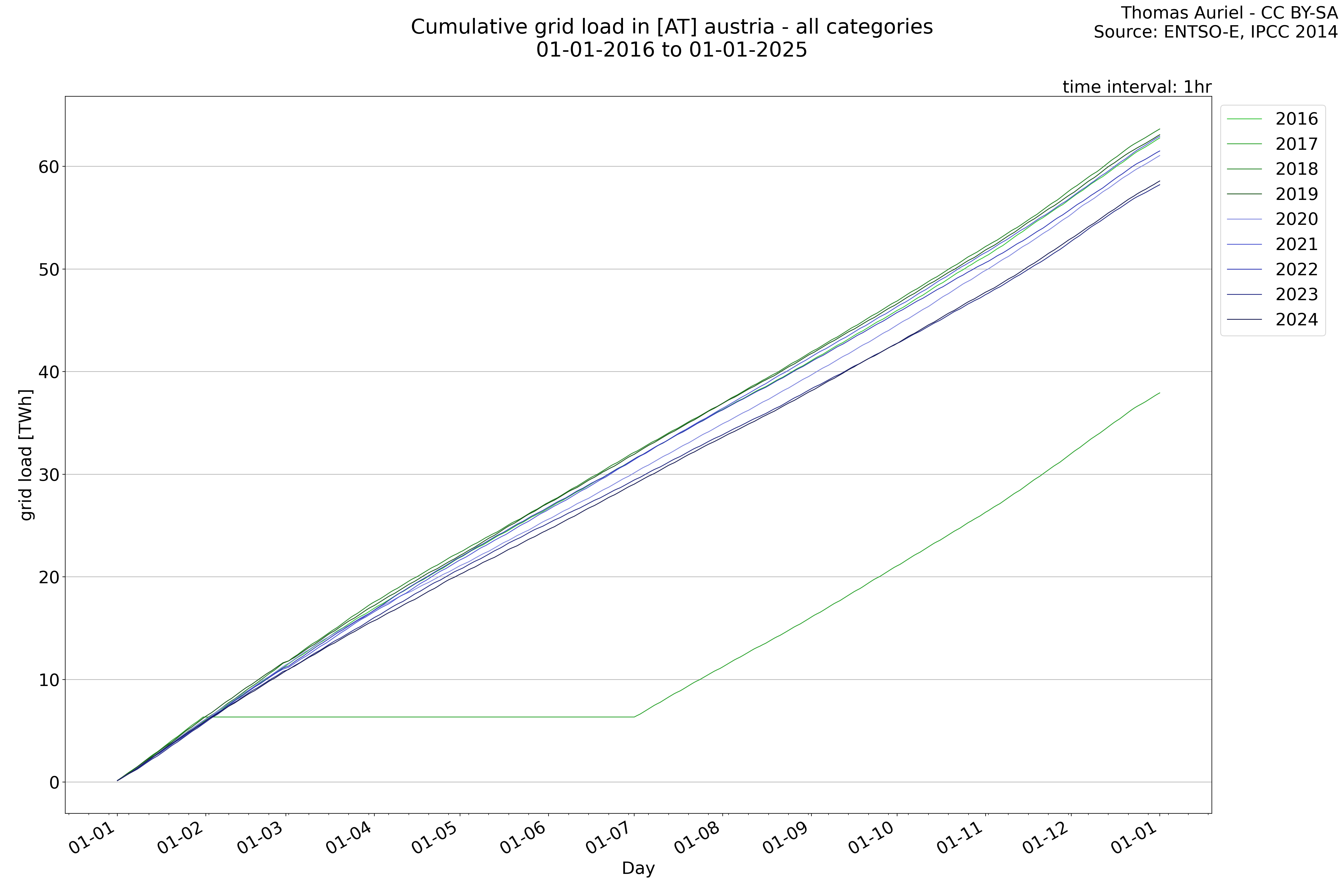
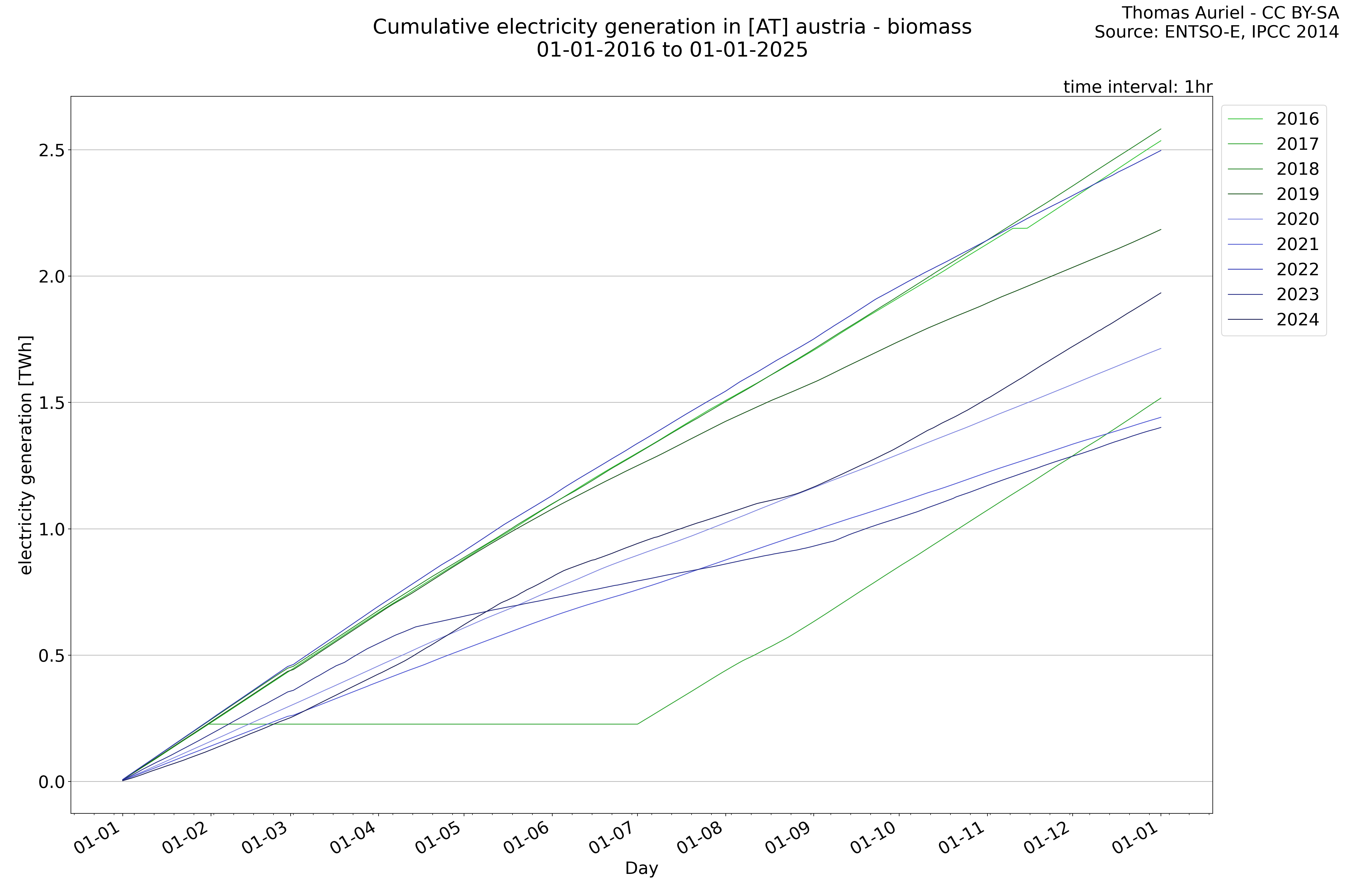
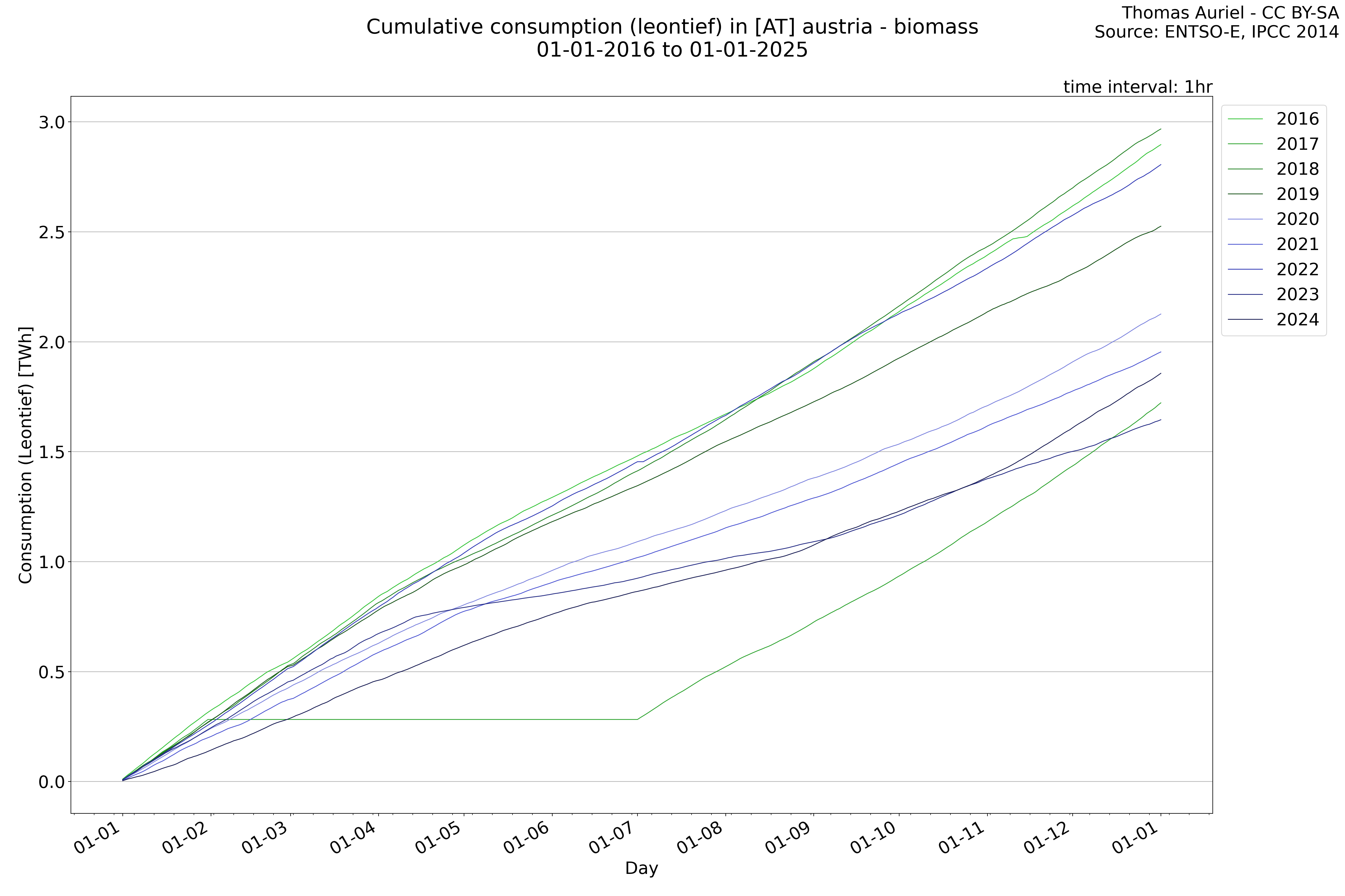
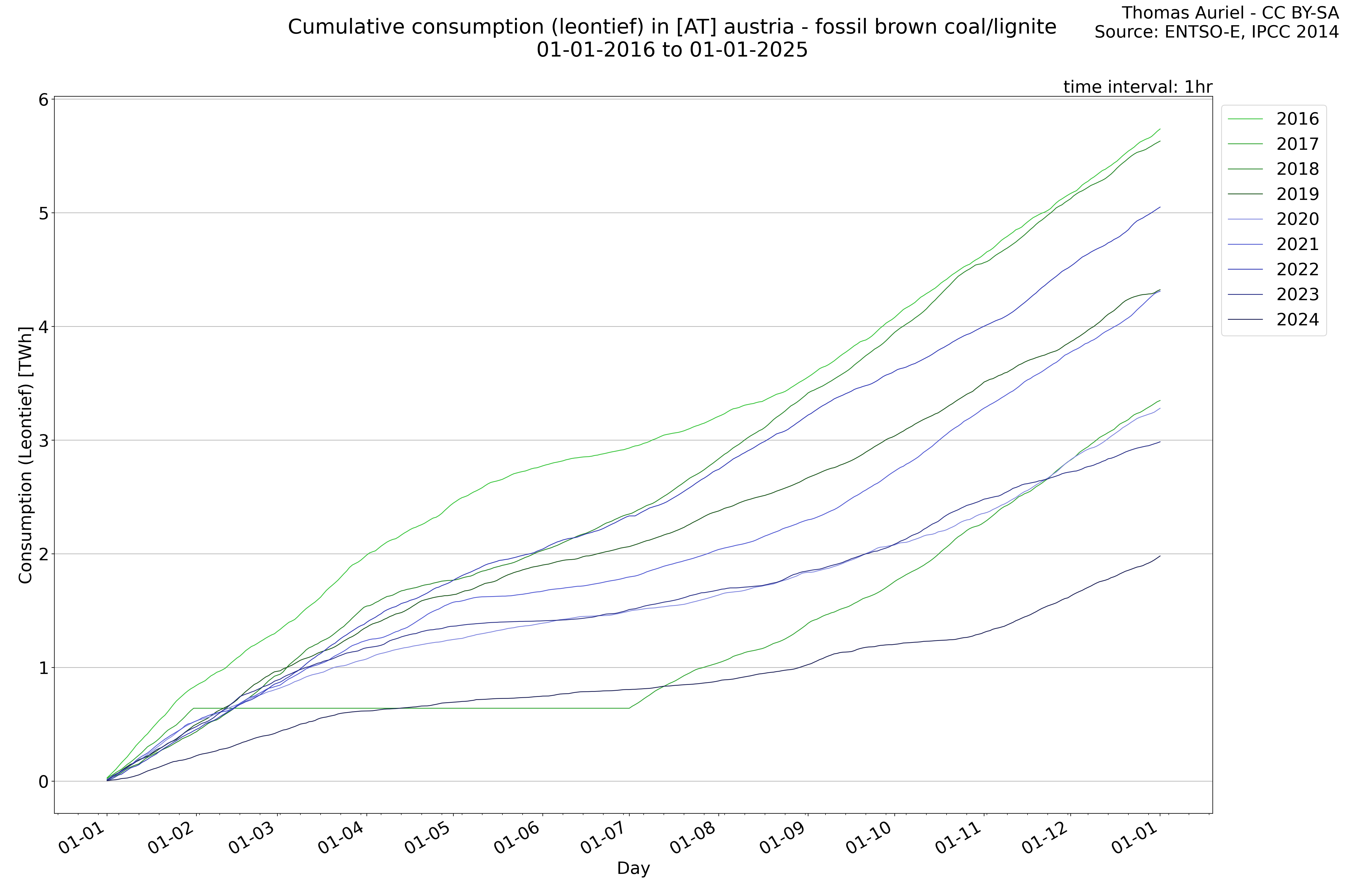
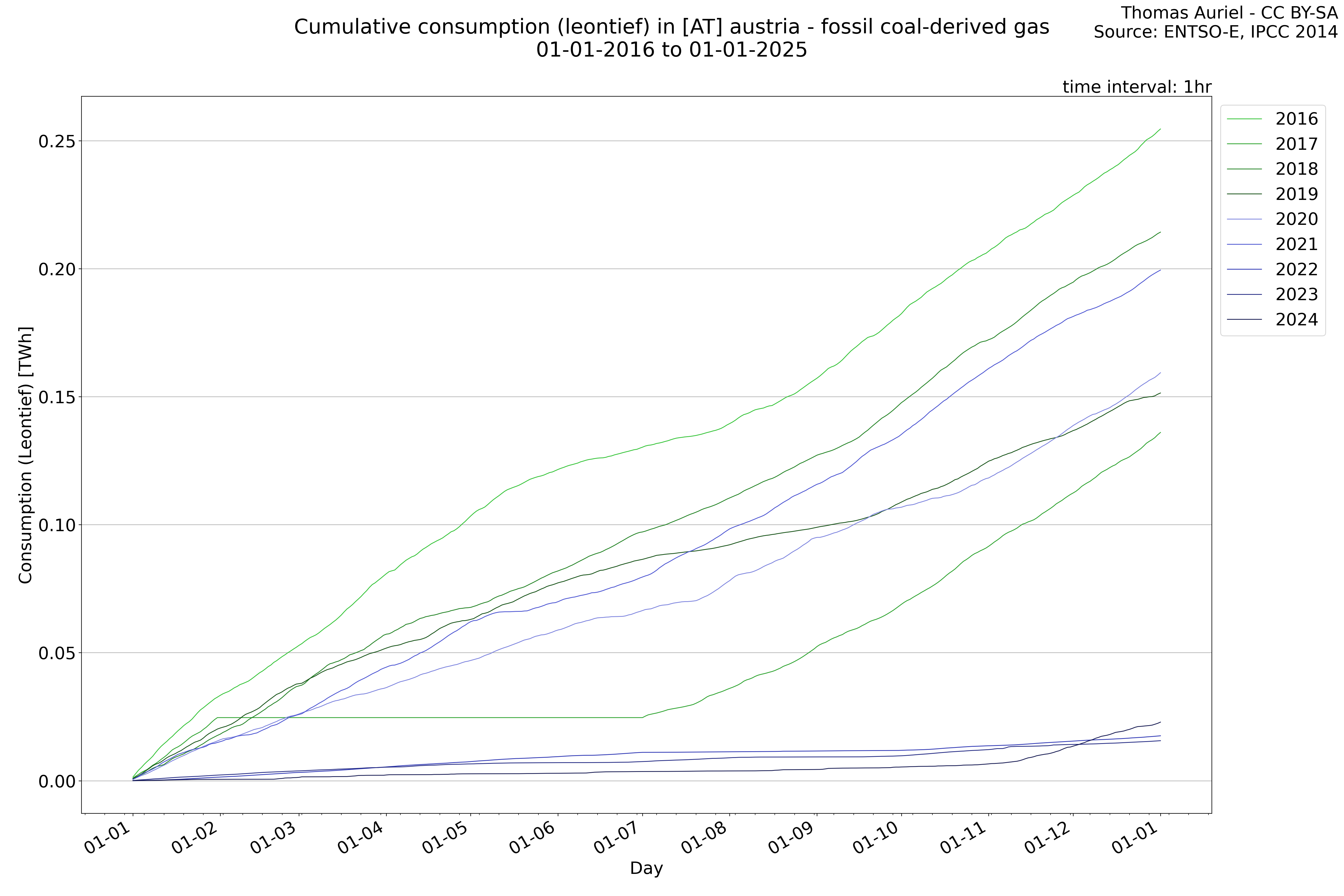
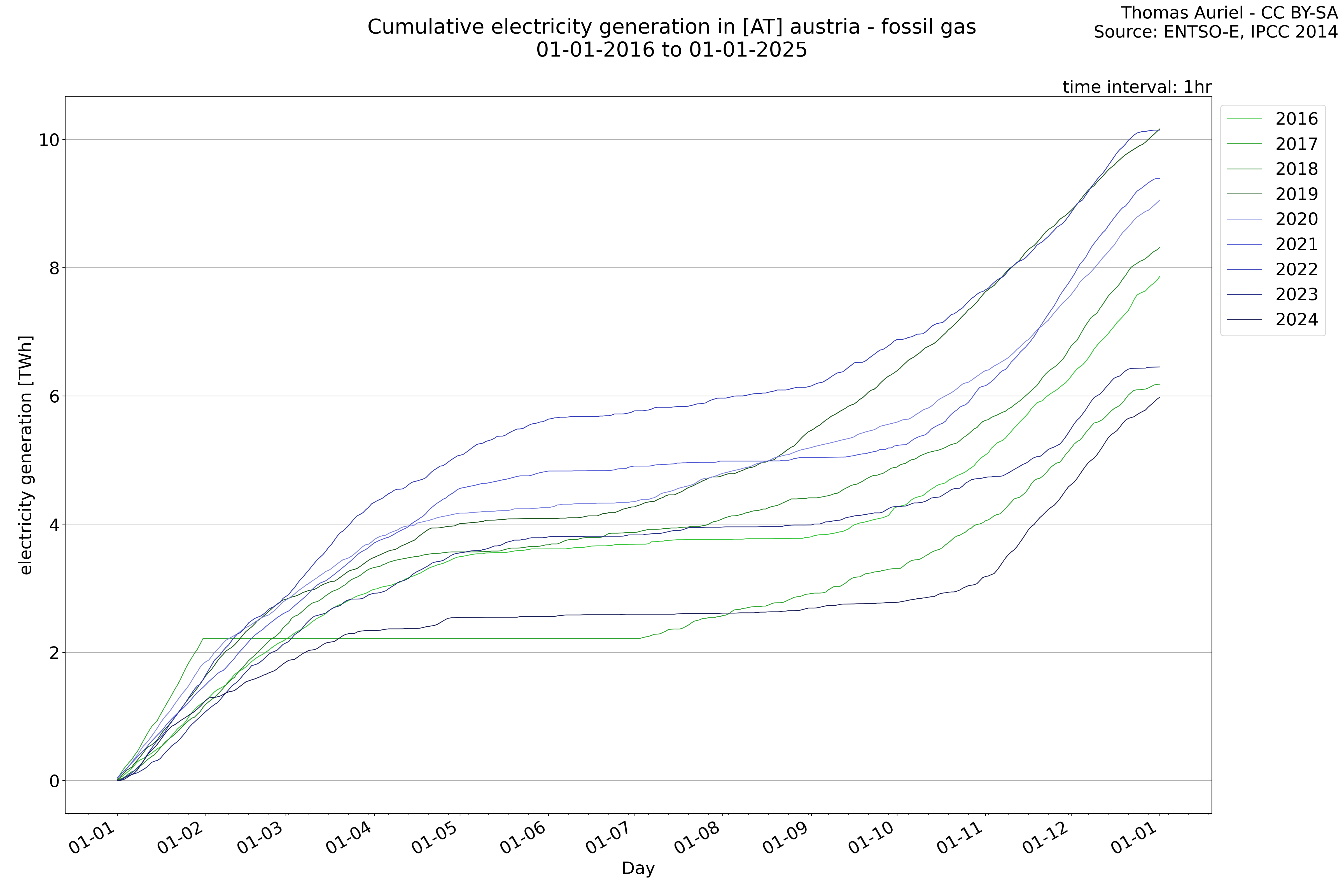
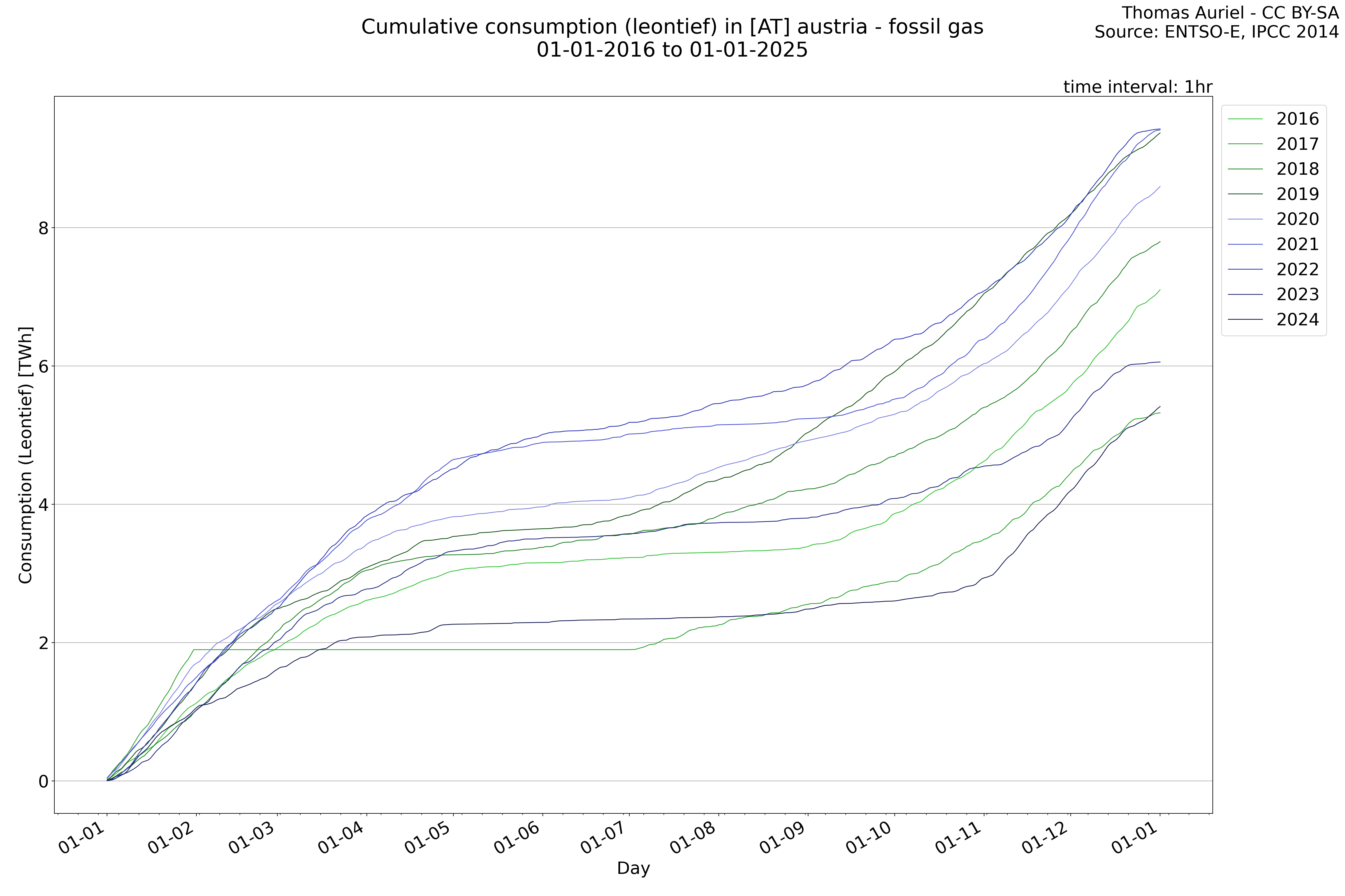
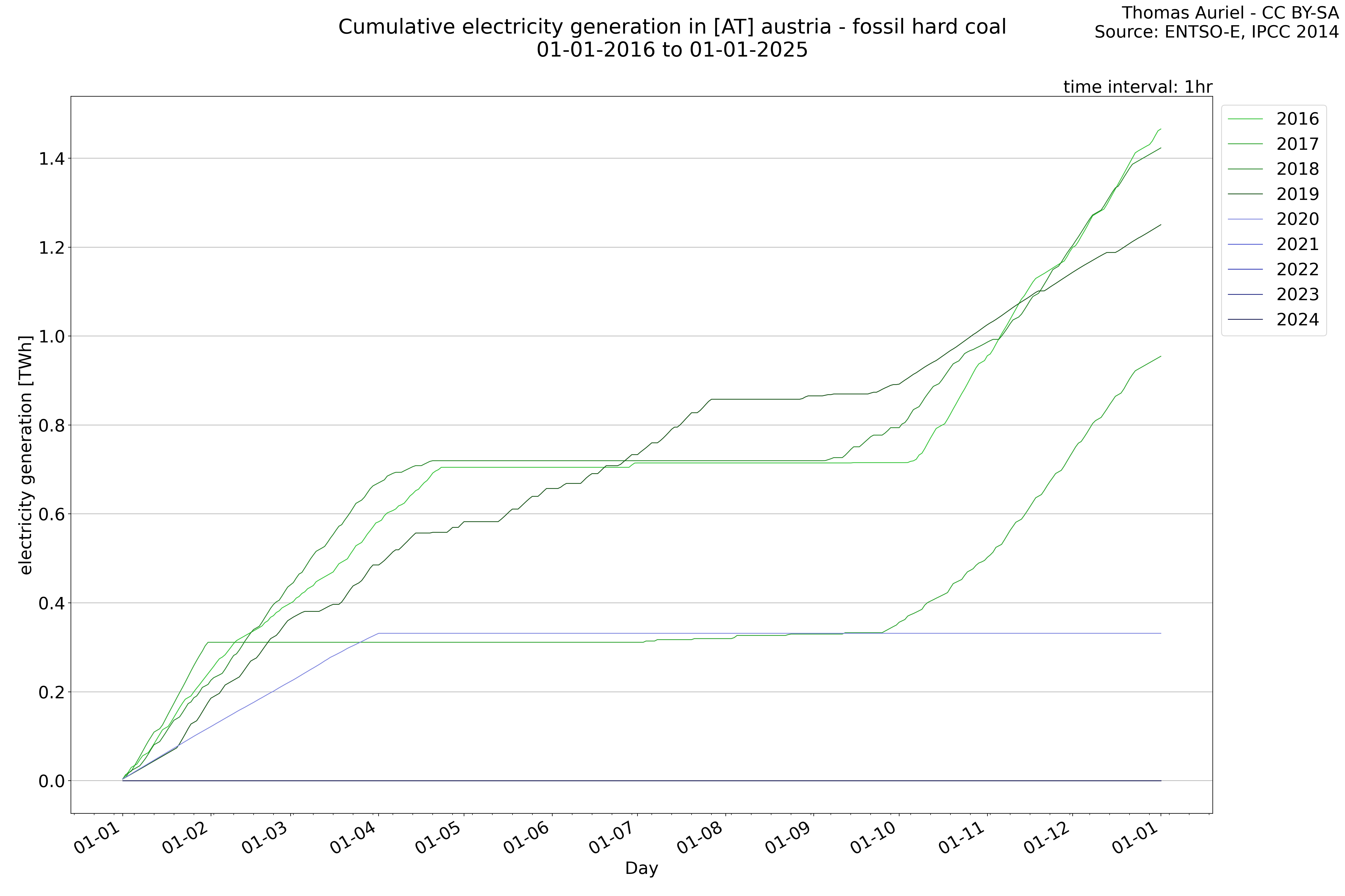
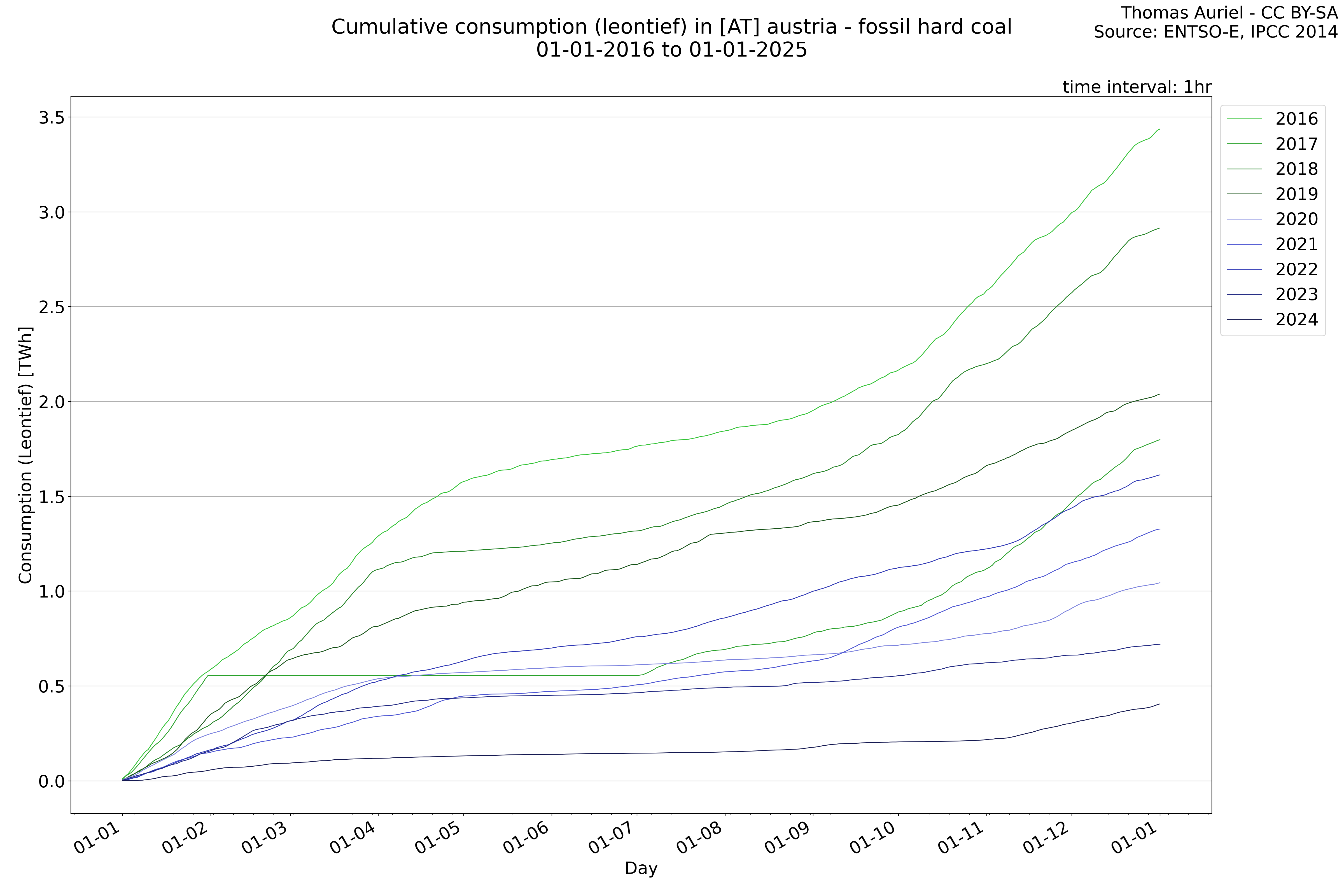
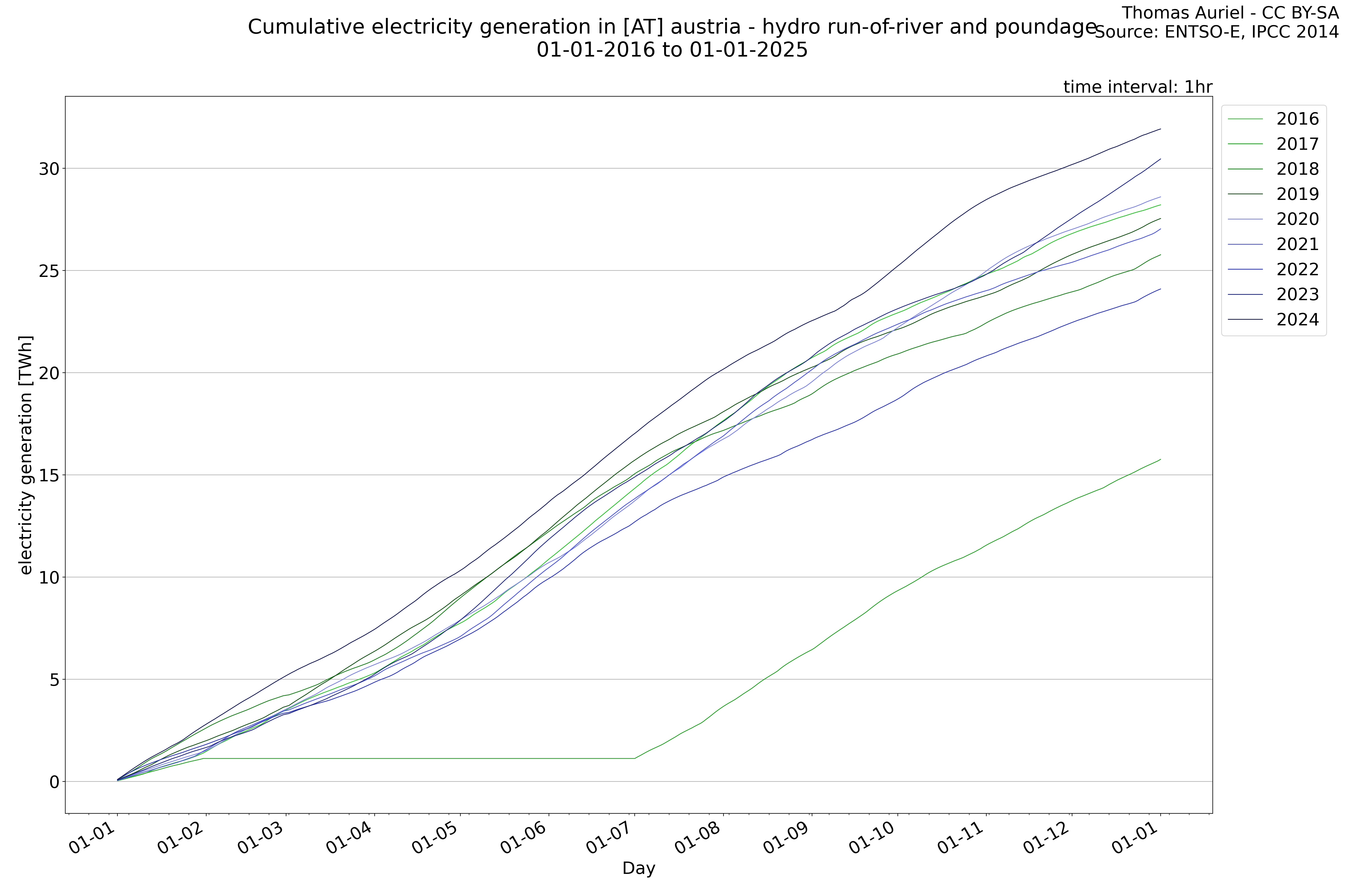
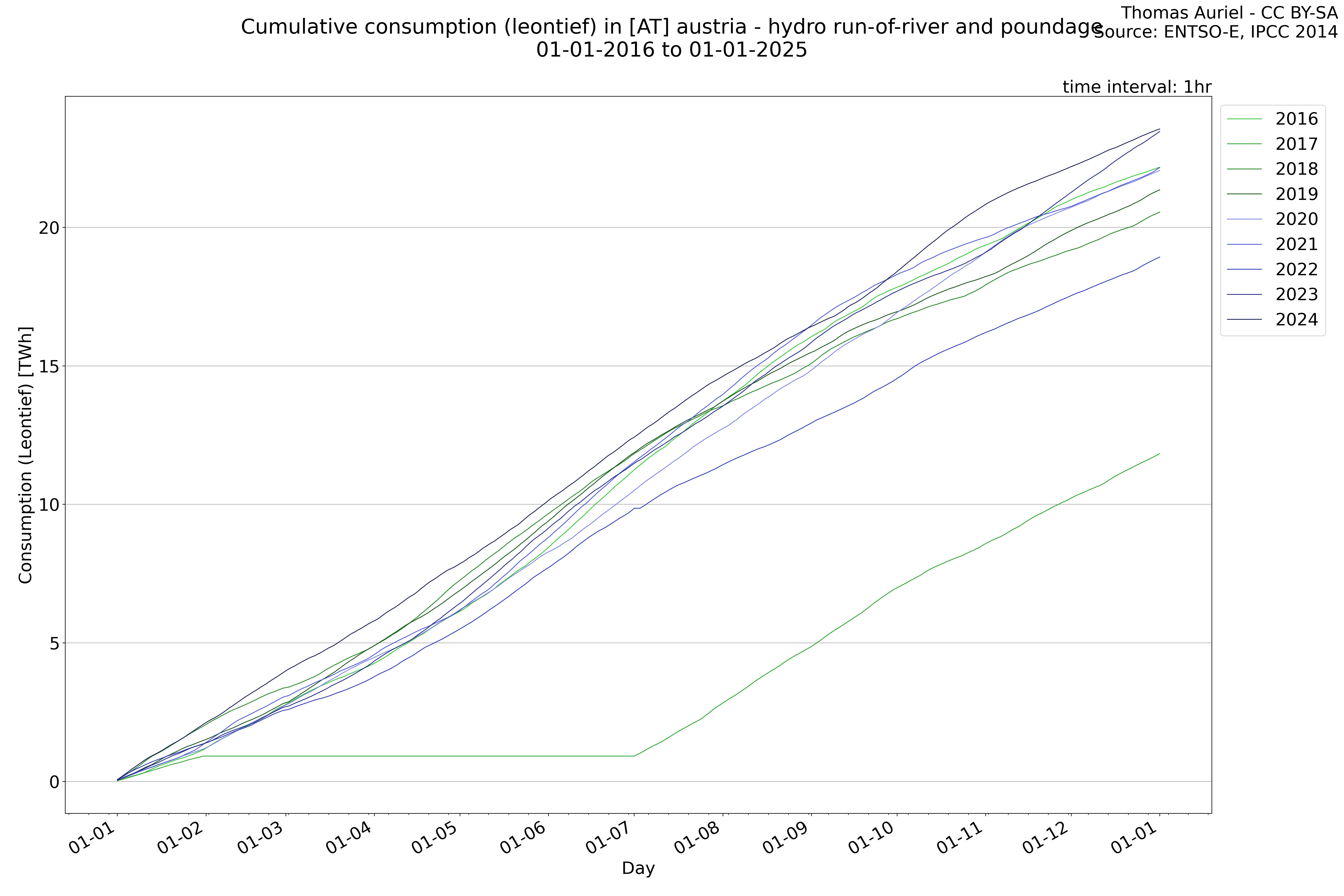
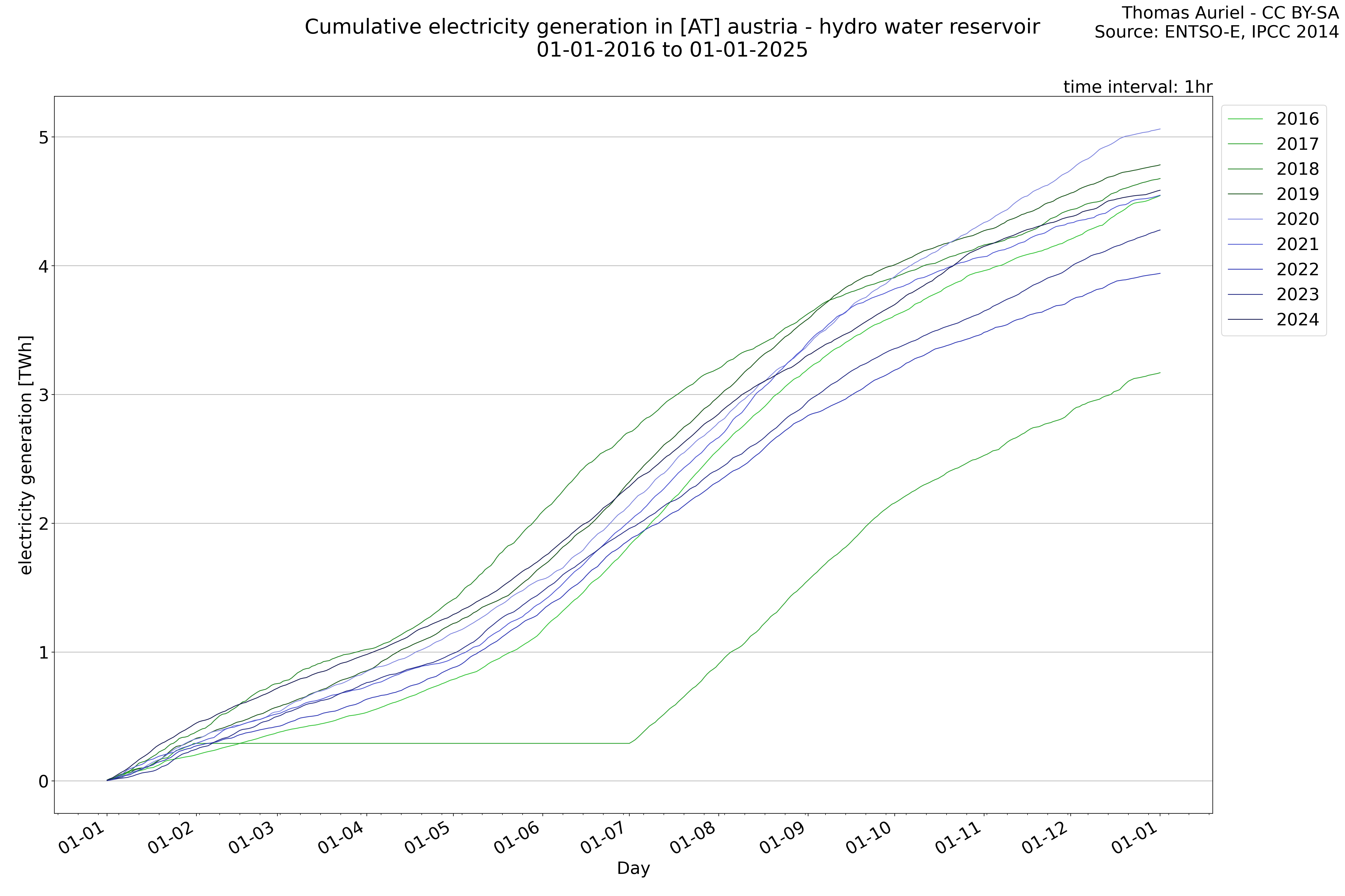
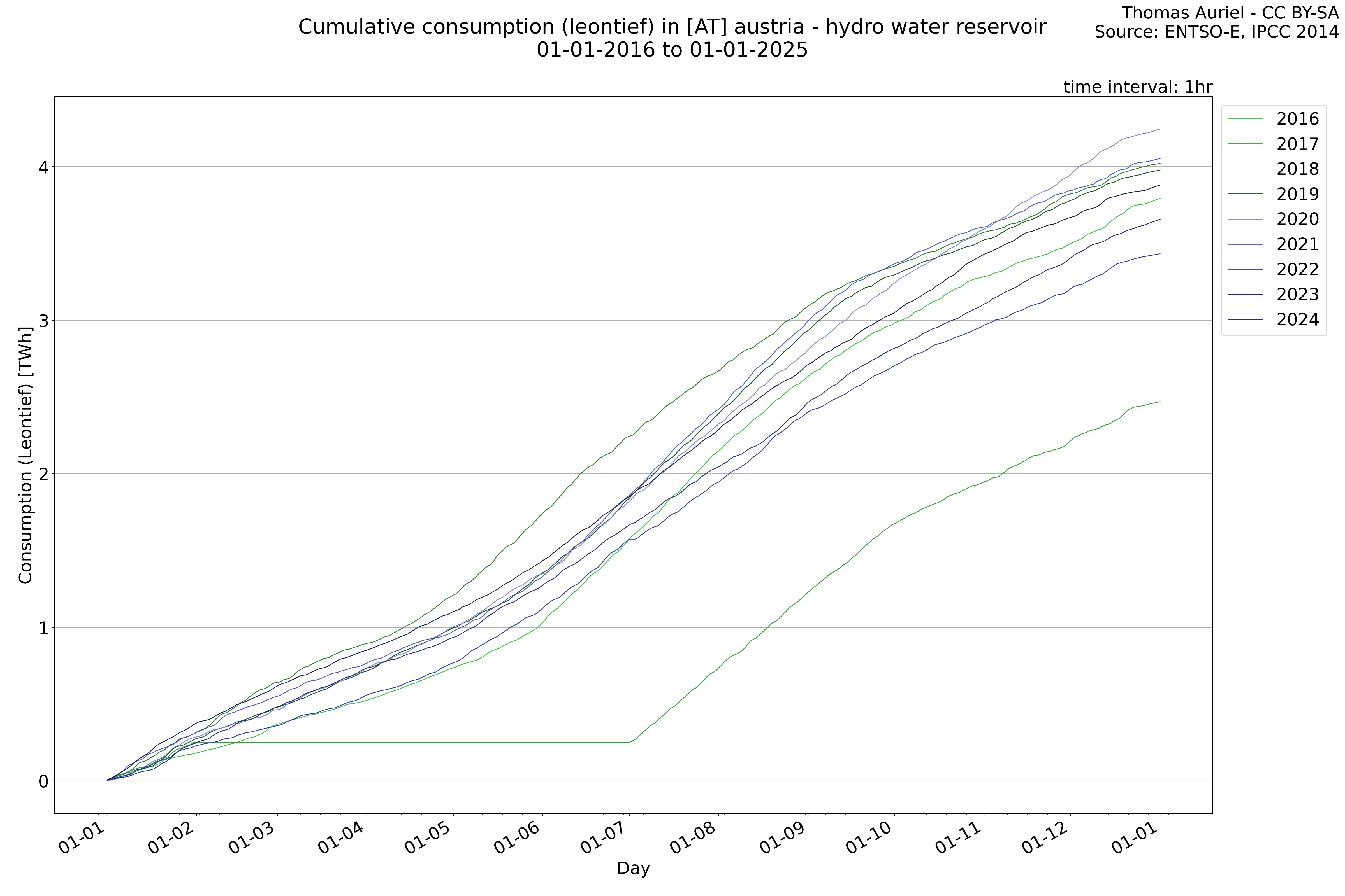
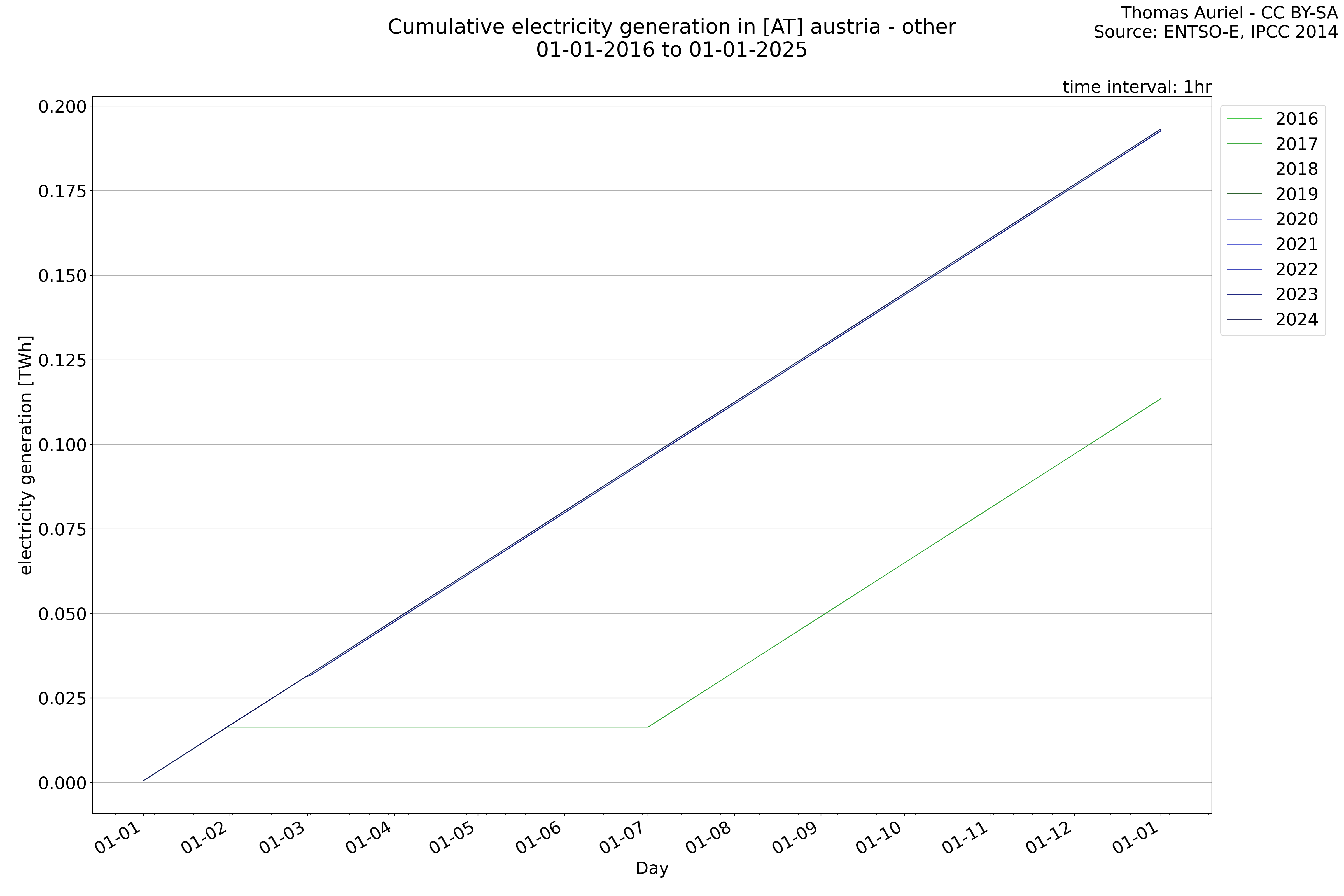
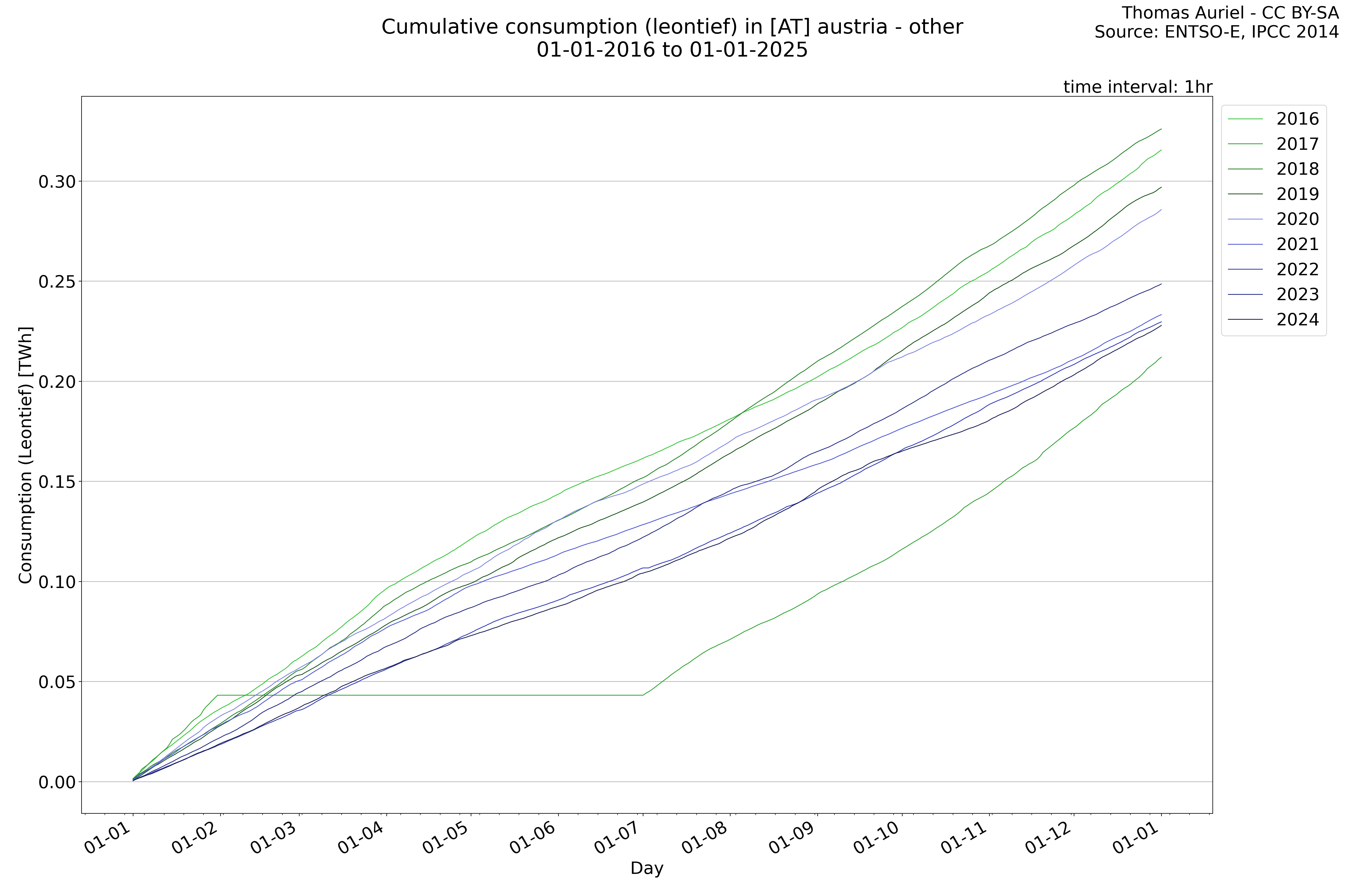
Cumulative production over years
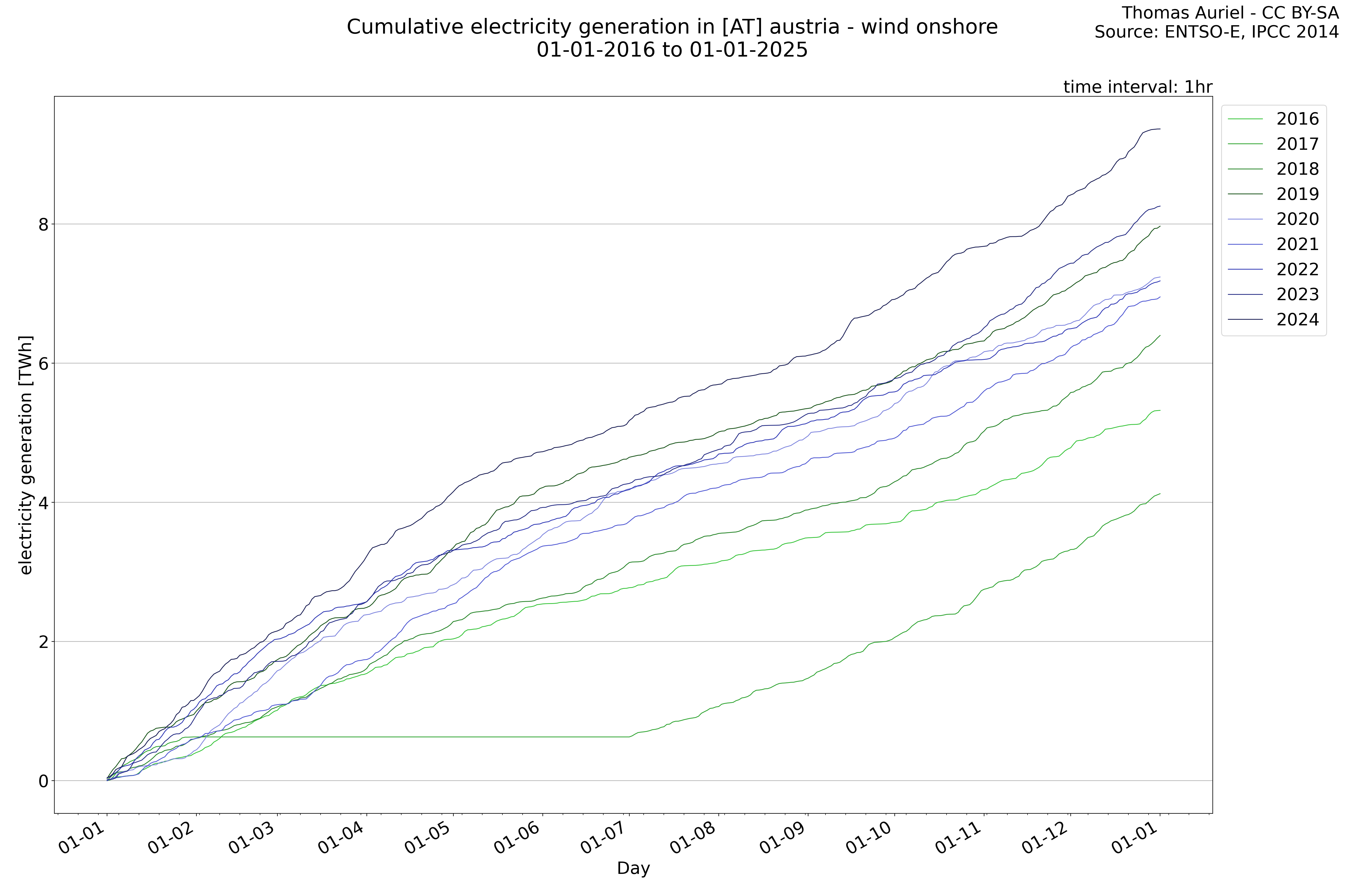
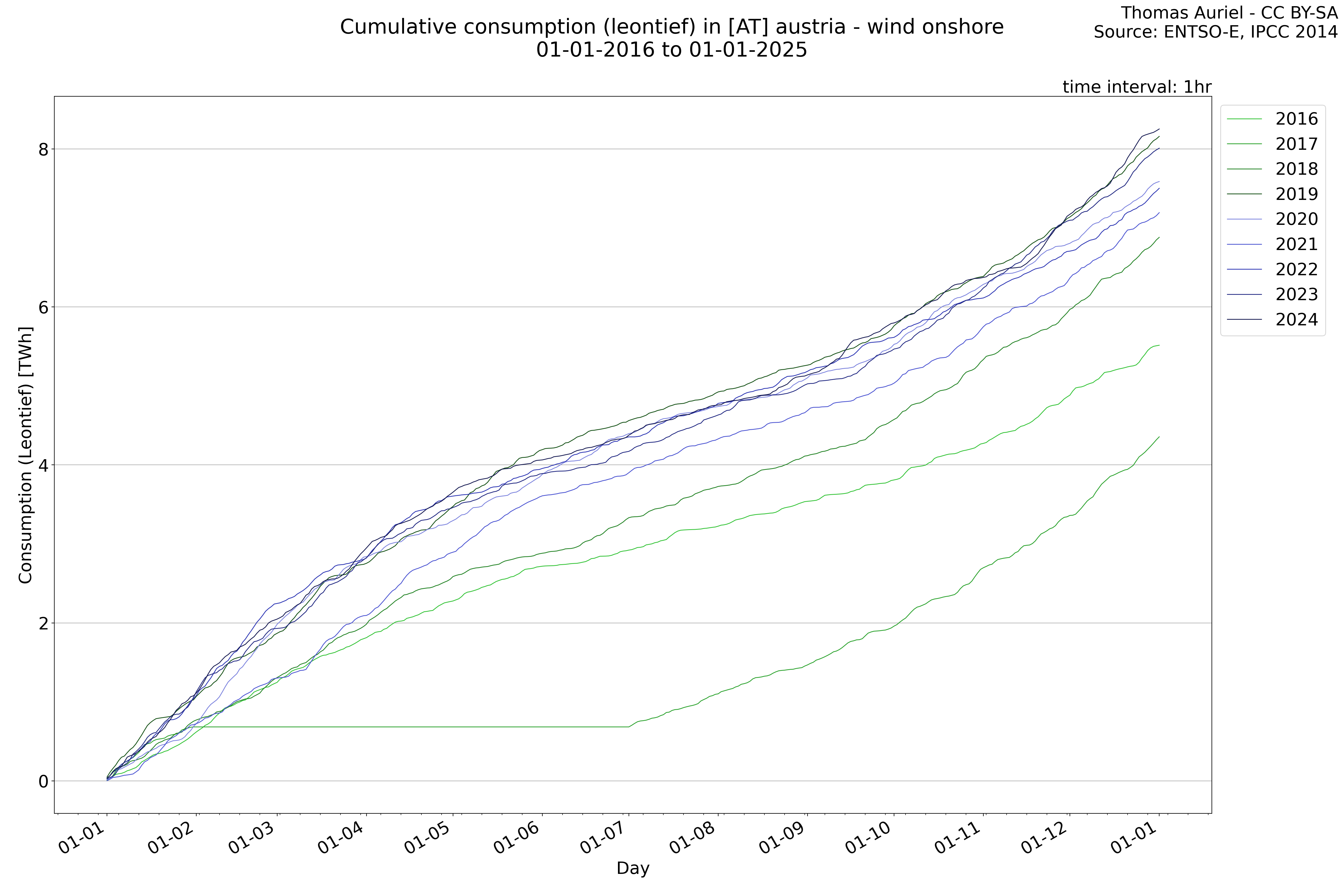
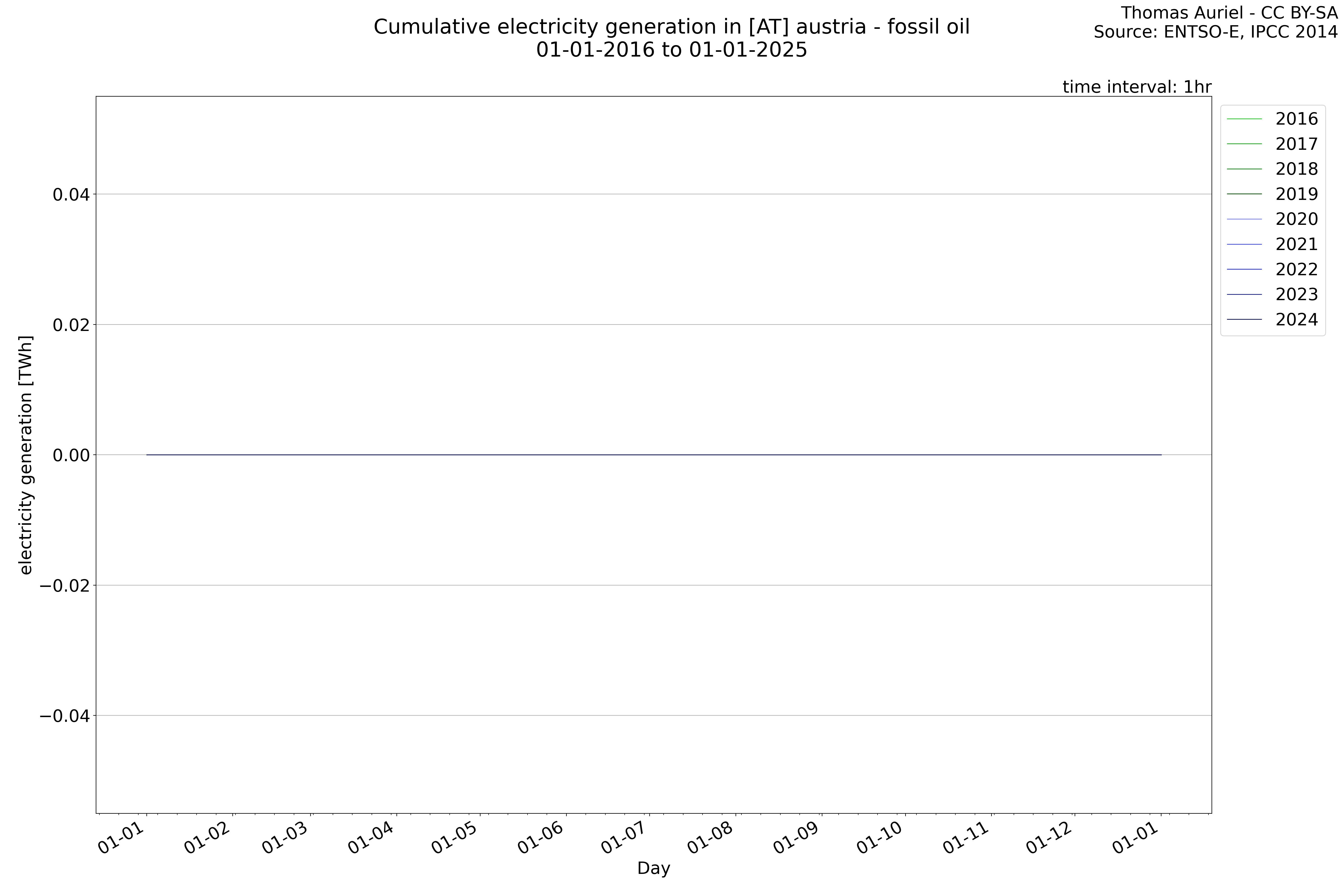
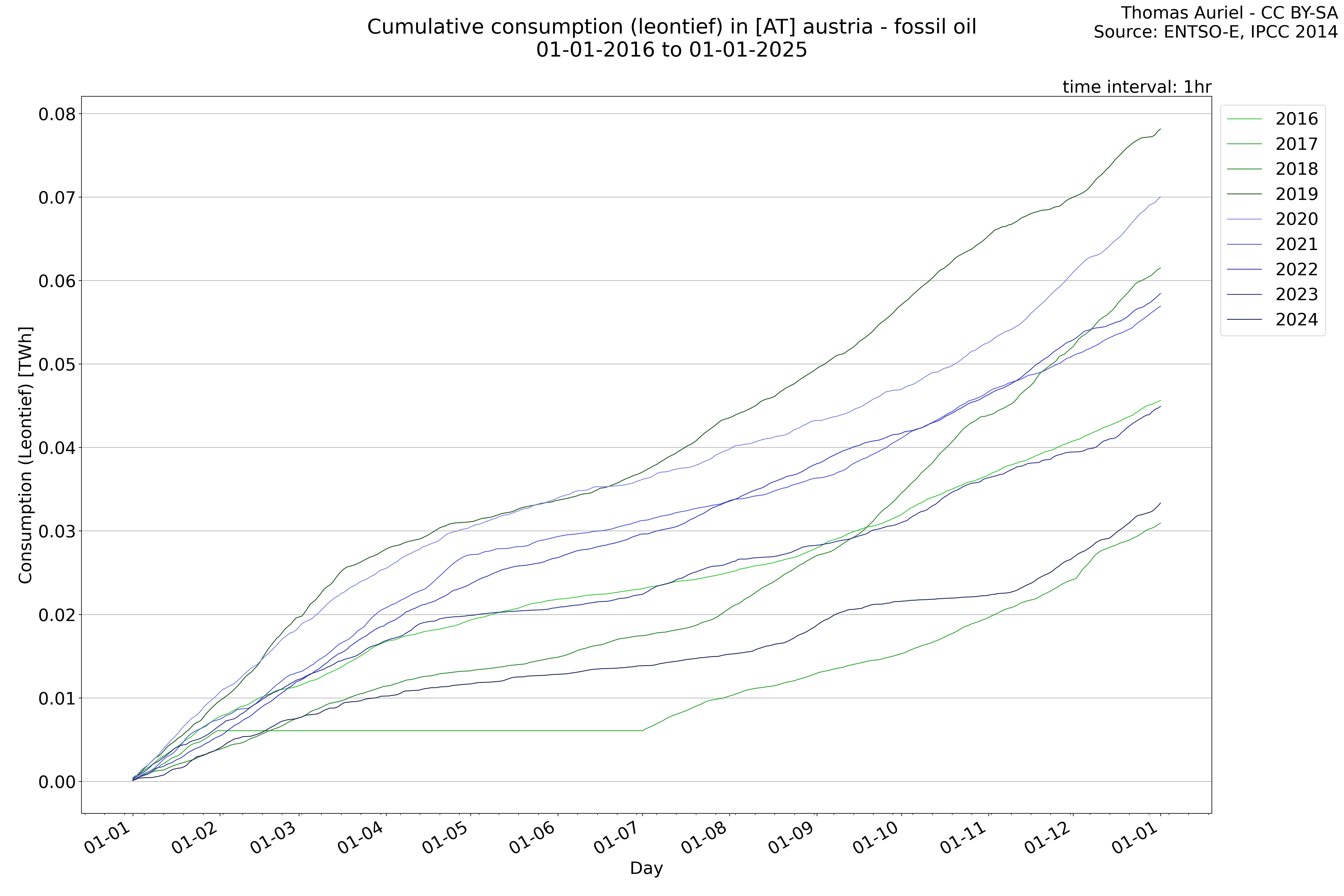
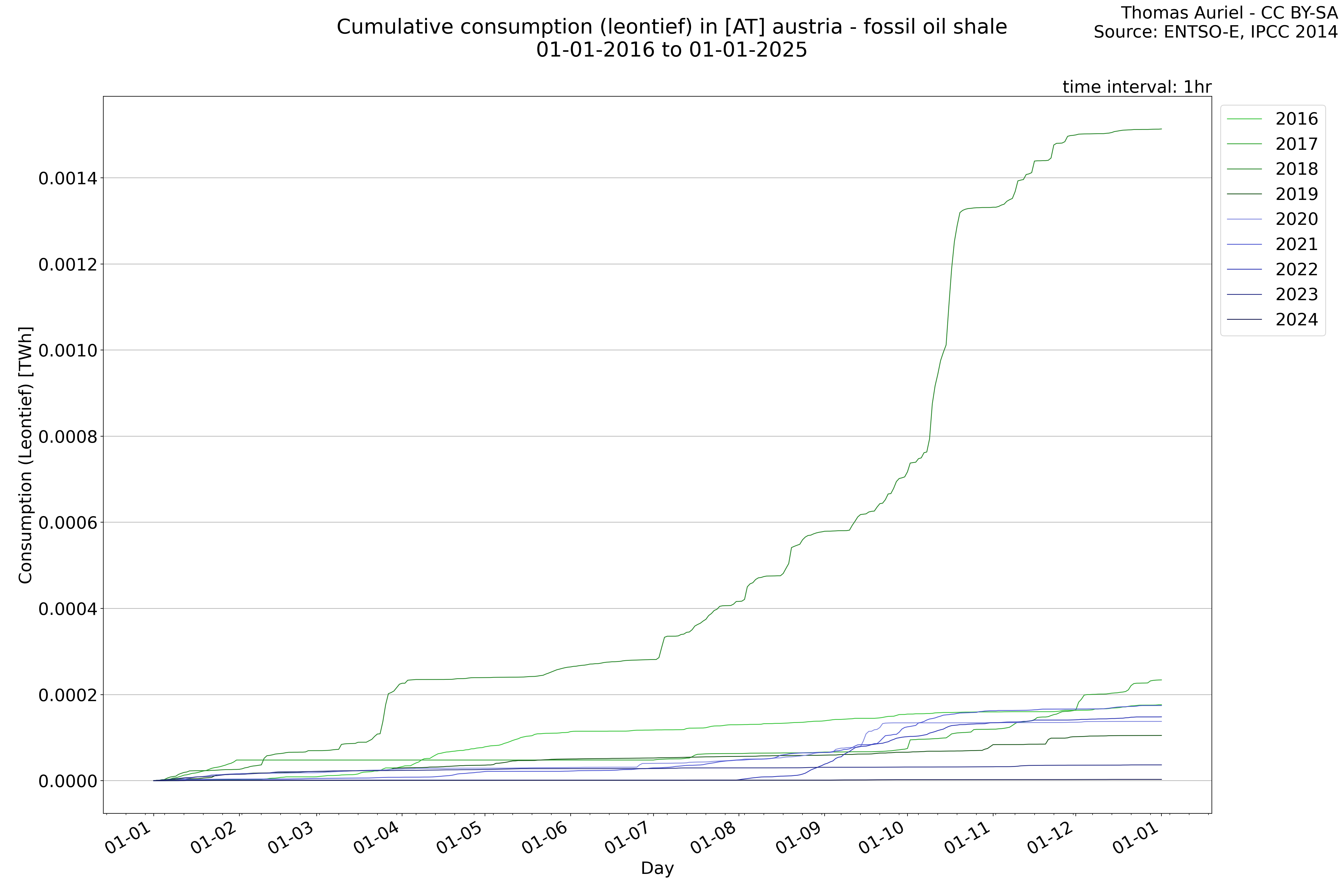
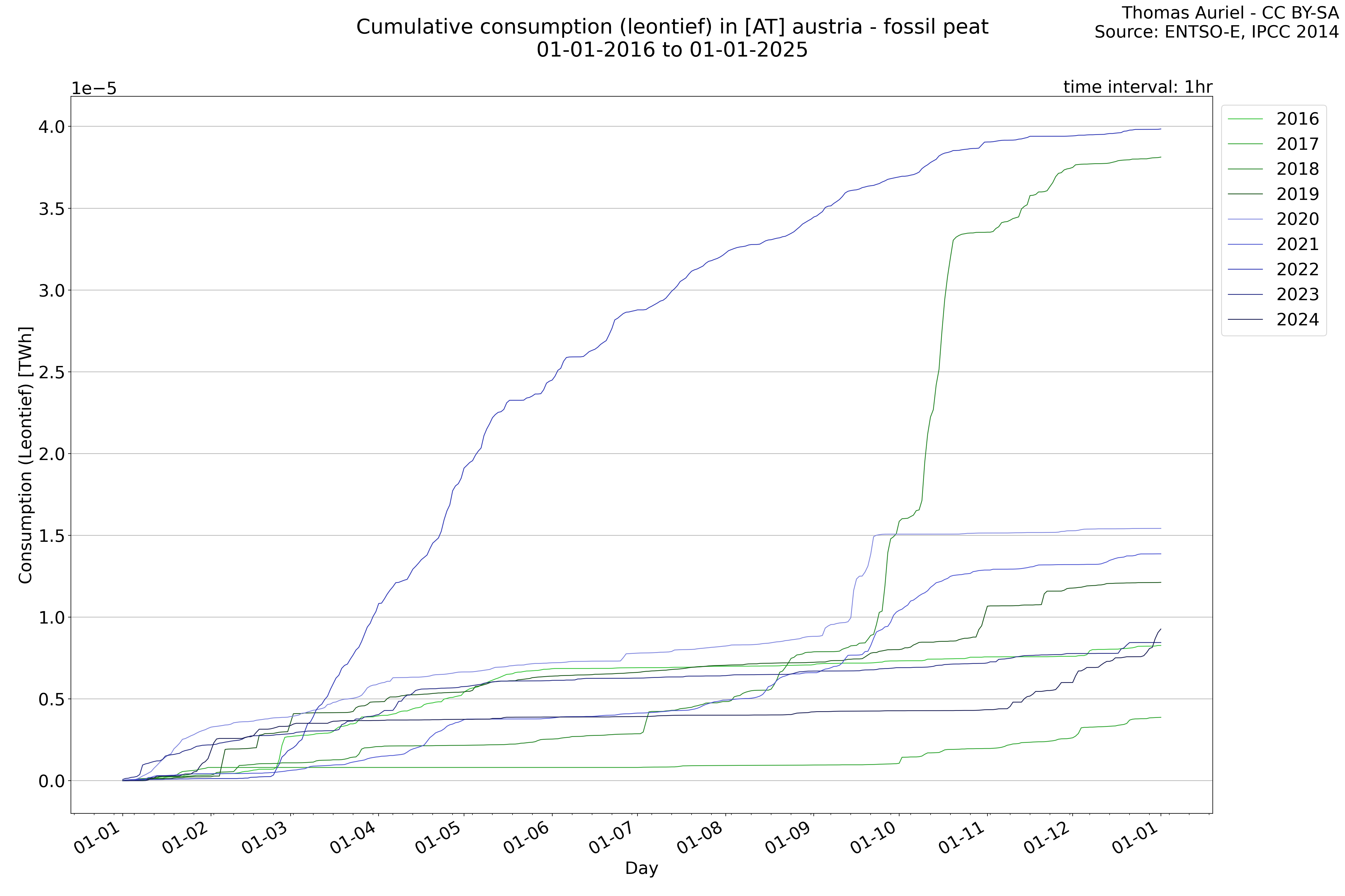
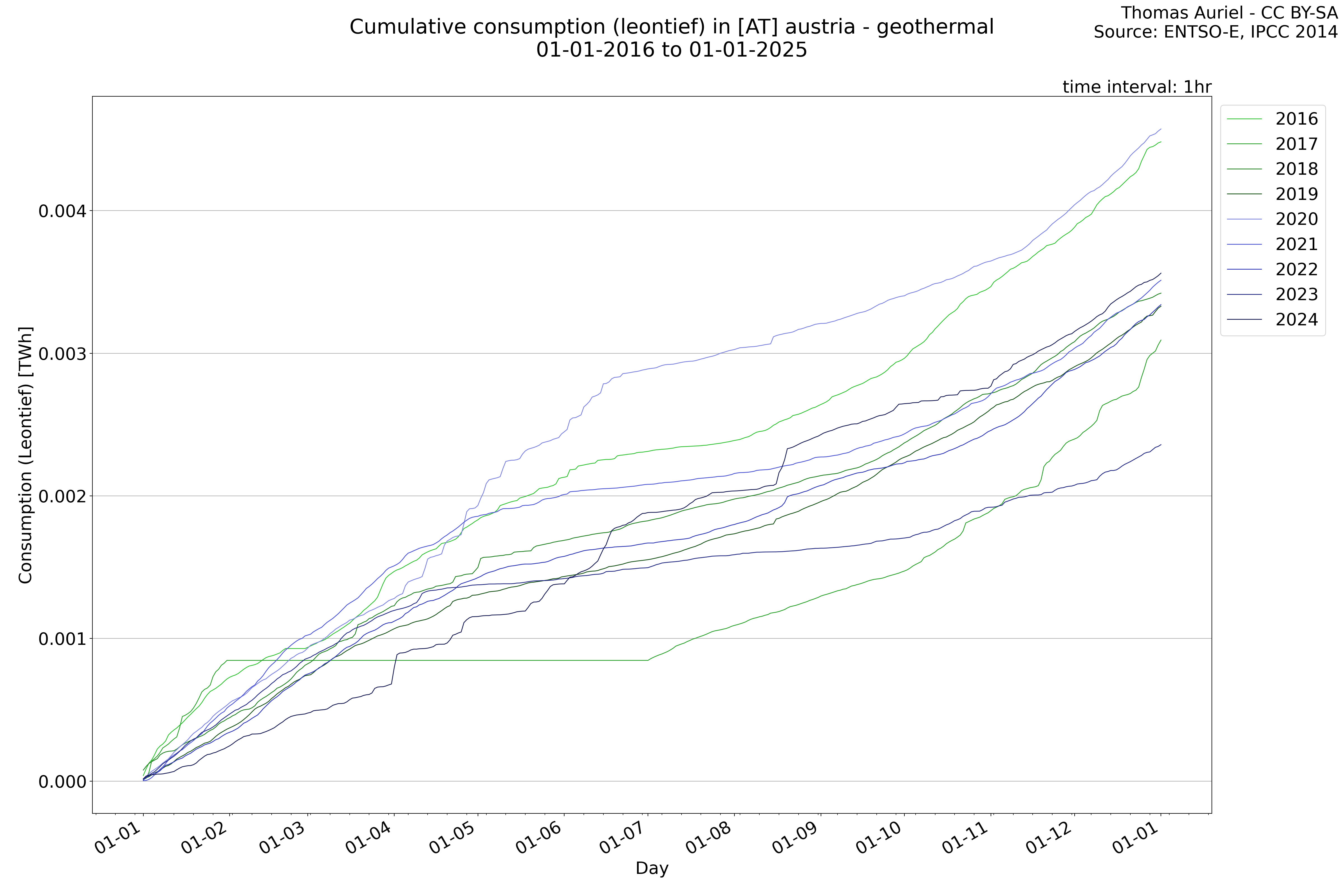
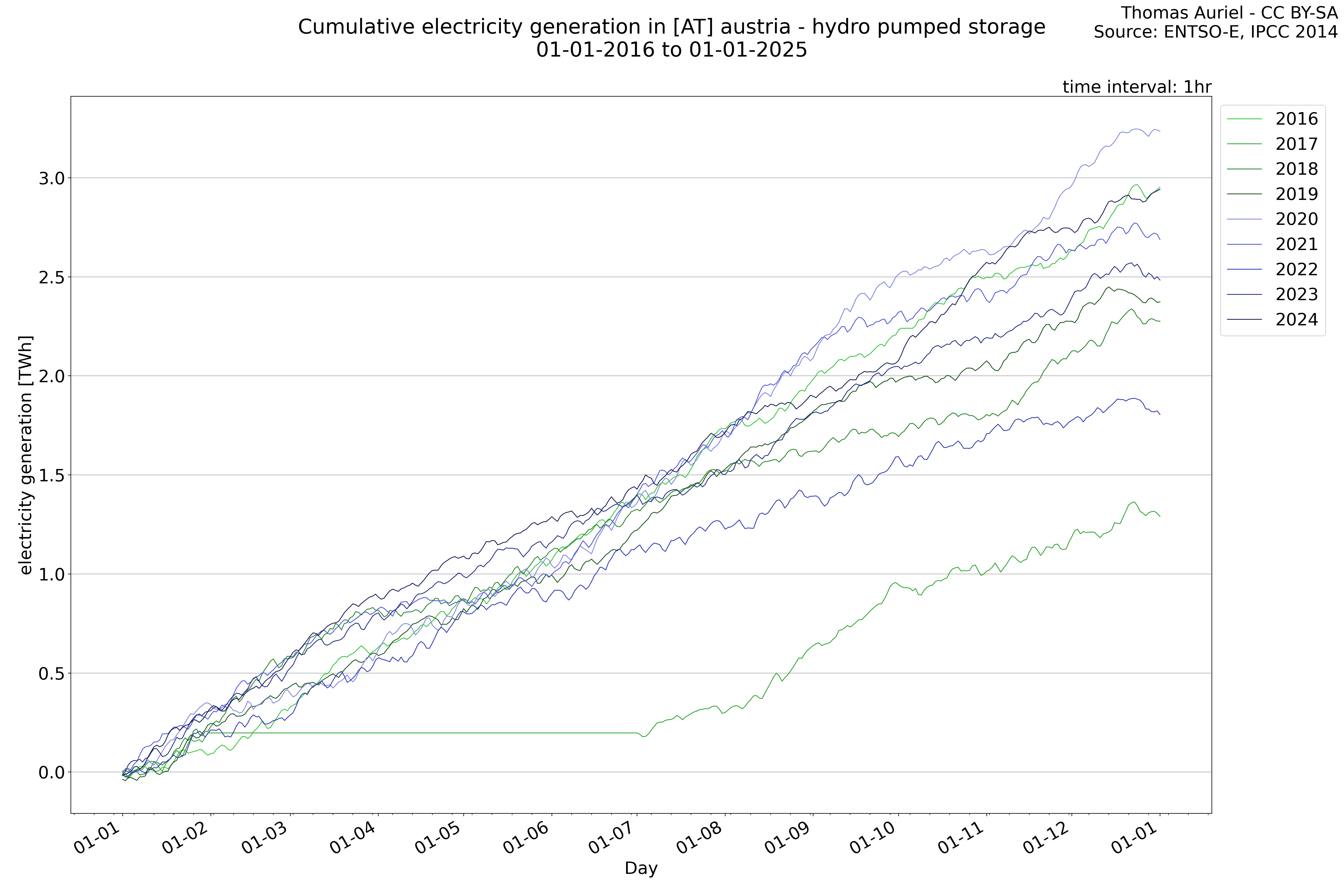
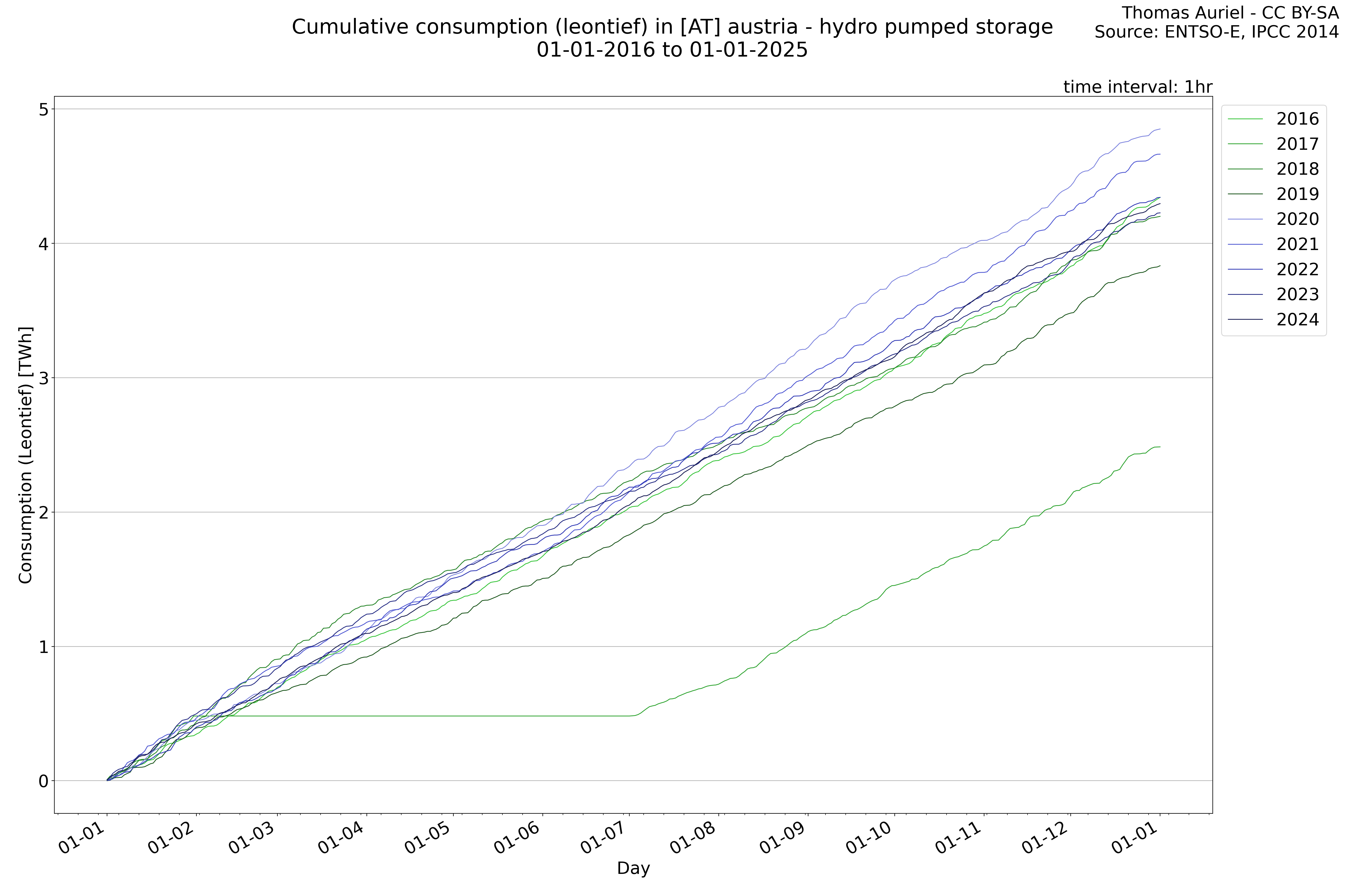
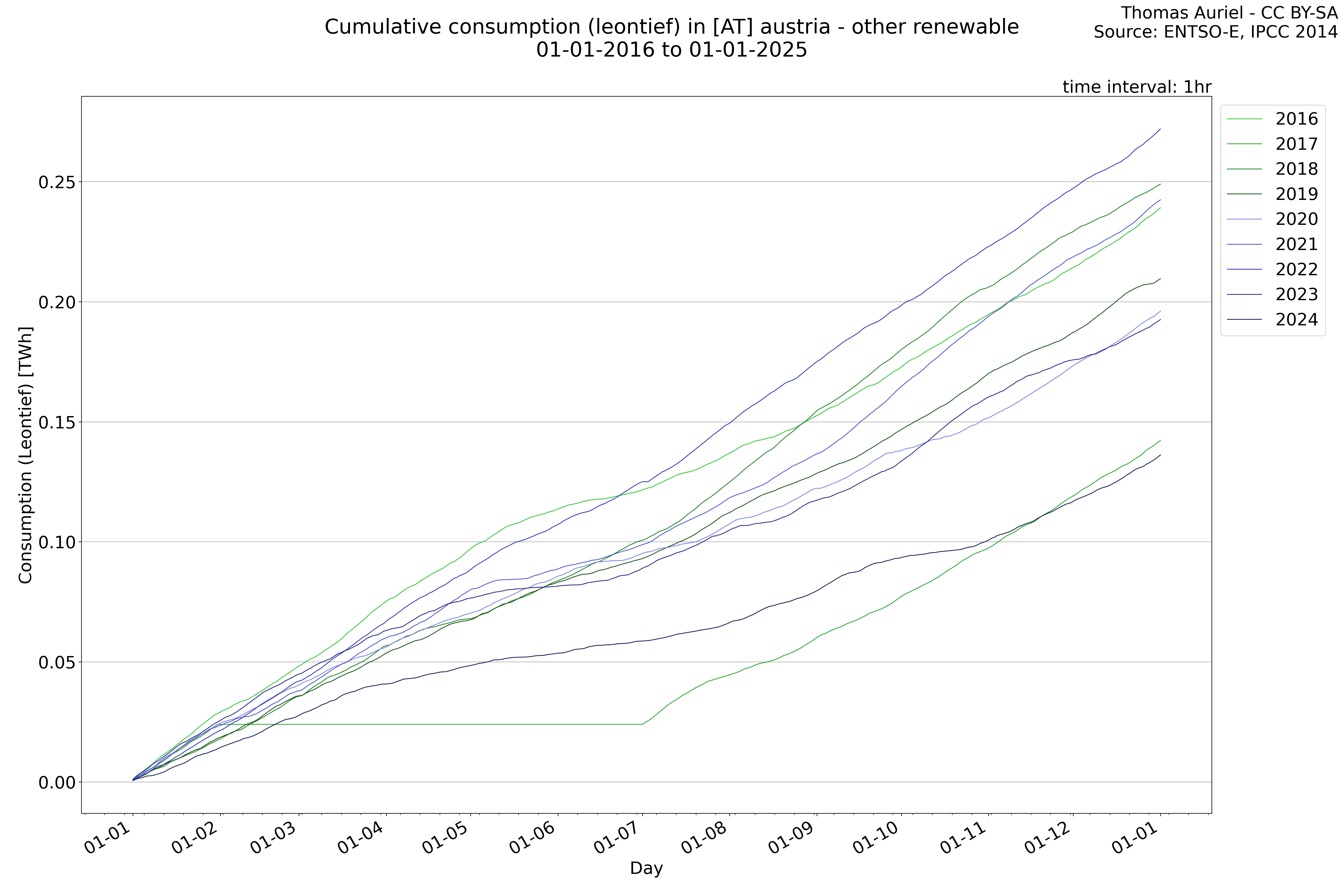
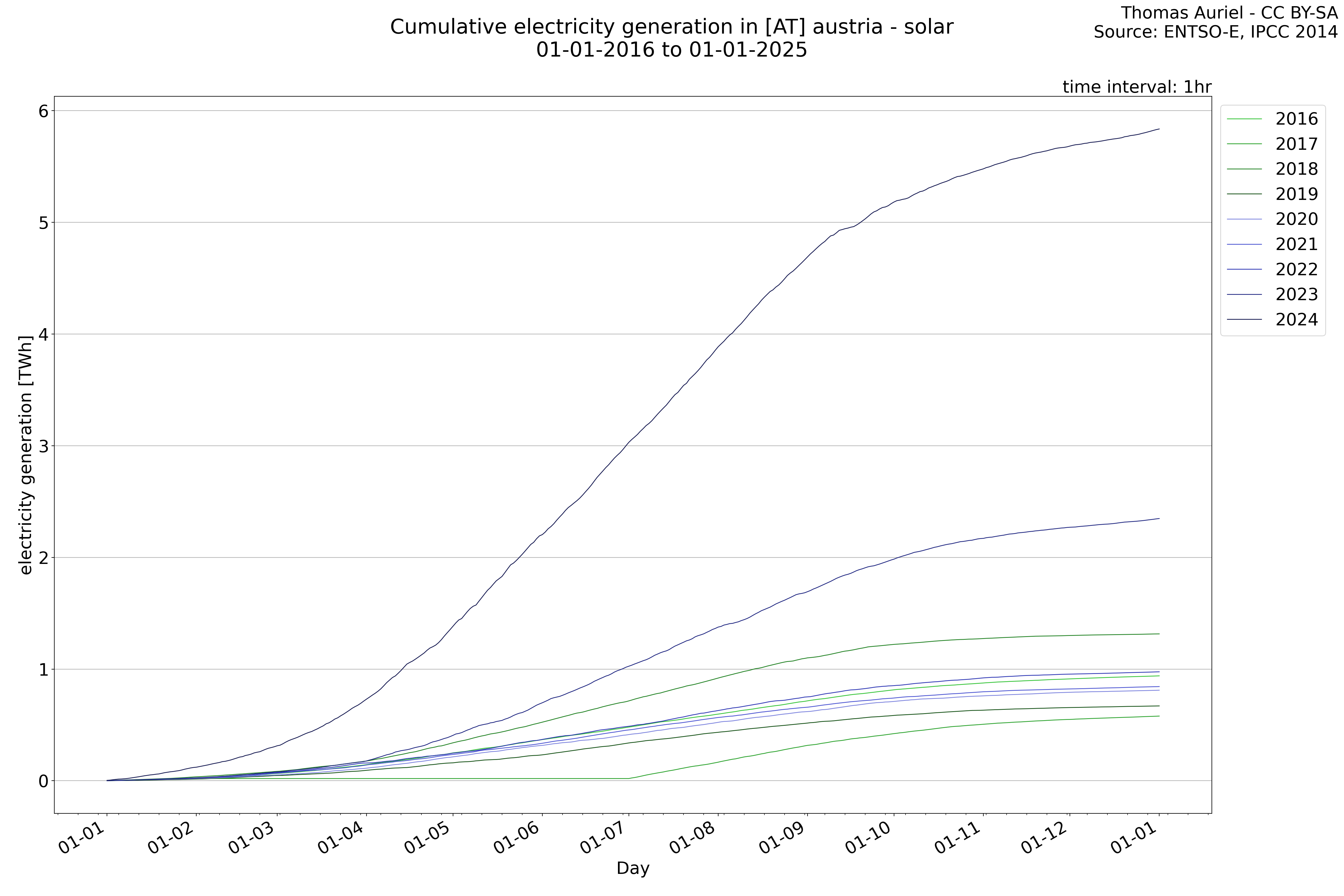
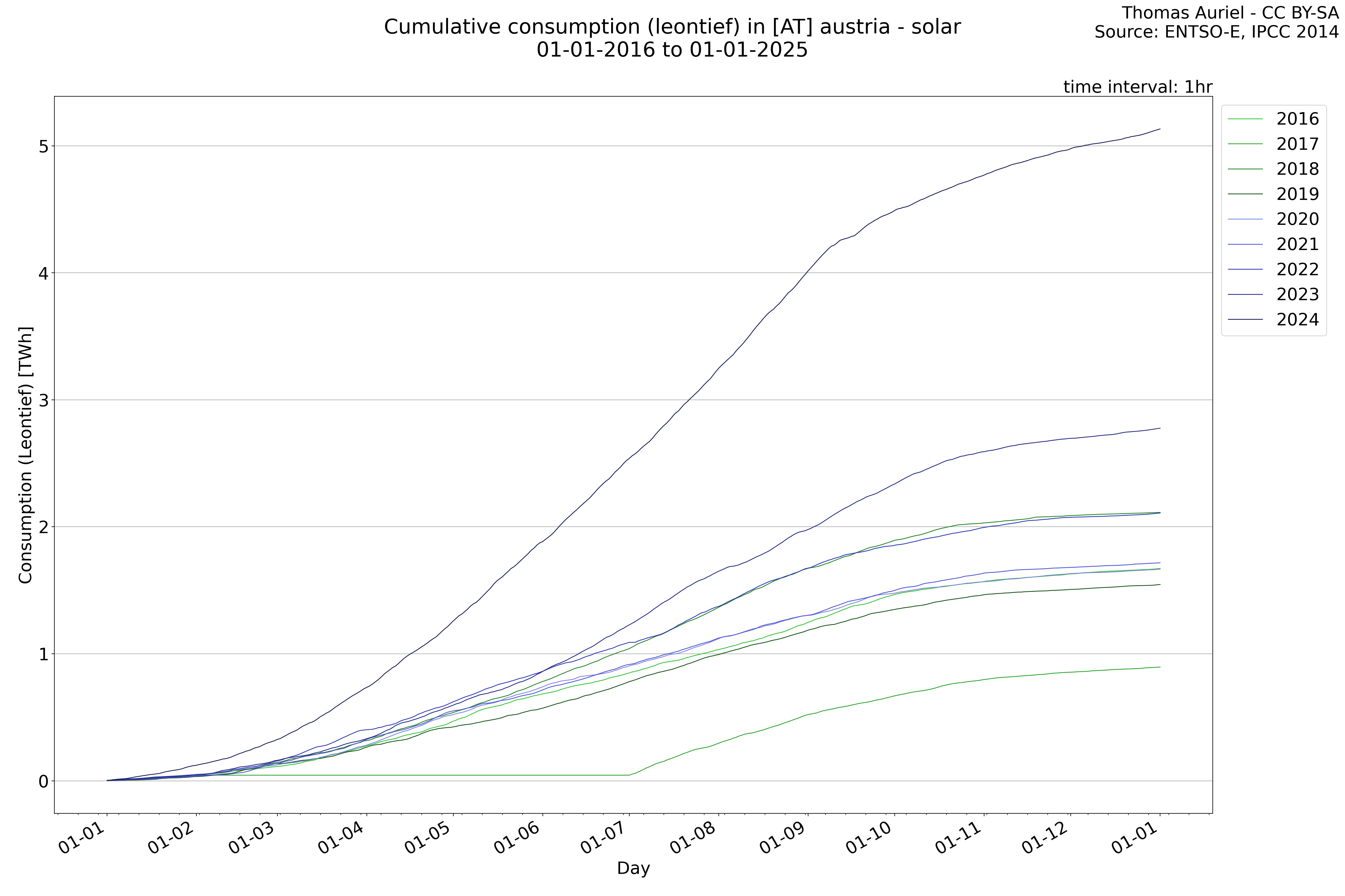
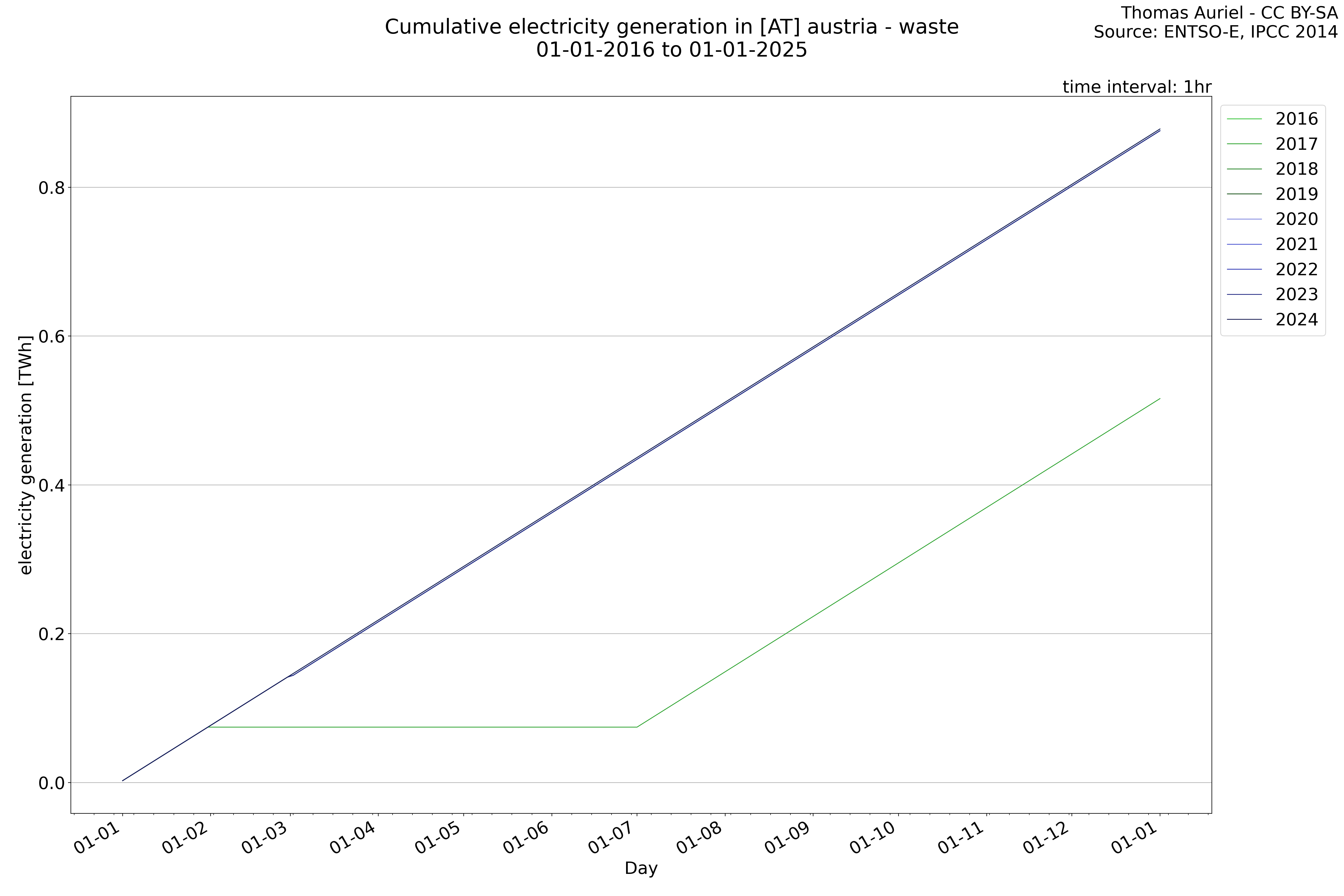
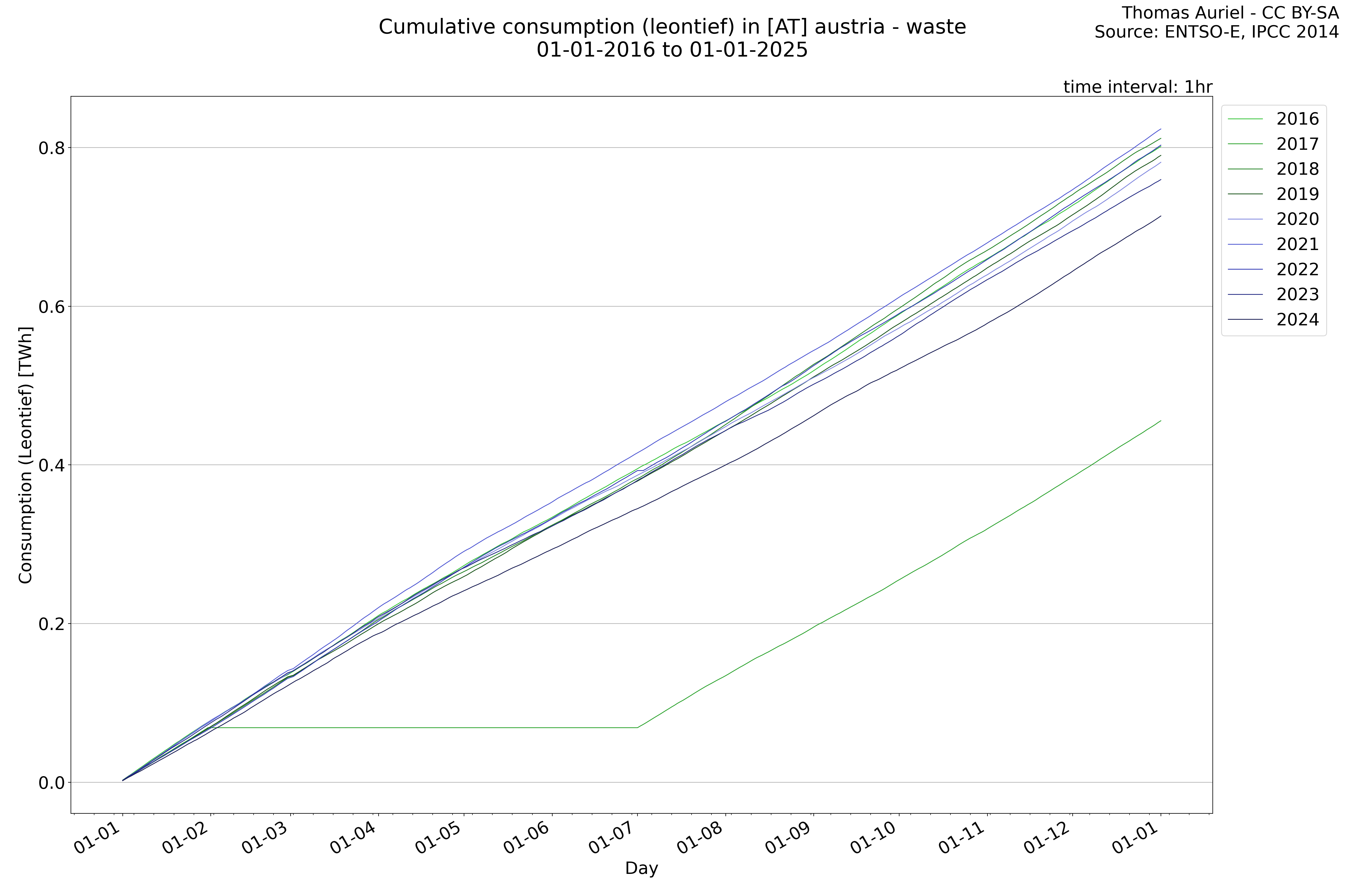
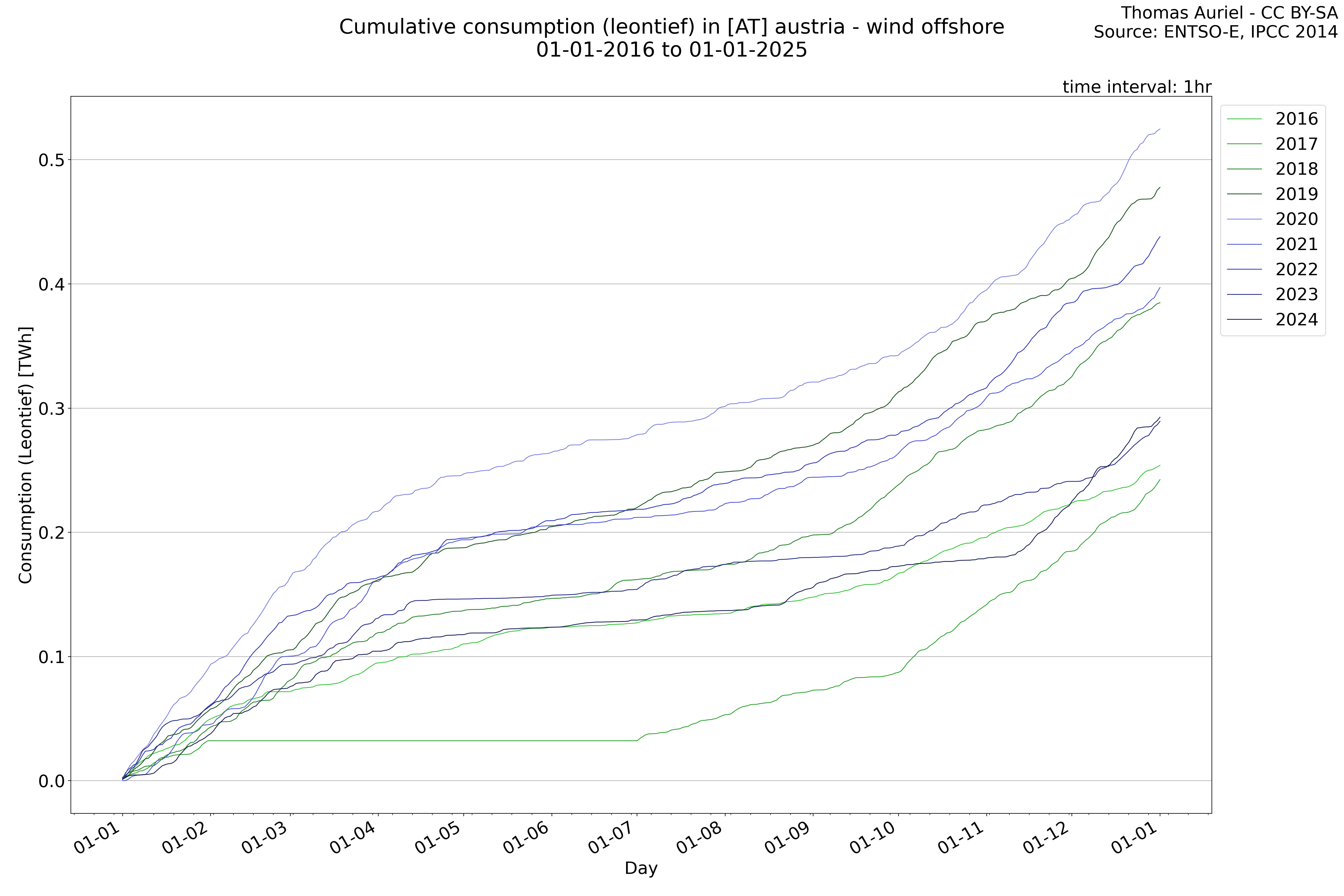
This plot is a cumulative sum plot, where each line represents the cumulative value of a specific metric (e.g., production, load, import, or export) for a given year. The plot begins at zero, and as the year progresses, the cumulative value is updated to reflect the total amount accumulated over time. This visualization illustrates the overall trend of the metric, showing whether the cumulative sum is increasing or decreasing, as well as any changes in the trend within the year. Additionally, the cumulative sum plot helps to reduce the impact of noise and short-term fluctuations commonly present in the raw data of production, load, import, or export. By smoothing out these variations, the plot emphasizes the broader, long-term trends. Consequently, this type of visualization facilitates a clearer understanding of the metric’s evolution across the year, revealing whether the activity follows a steady trajectory, shows signs of volatility, or experiences periods of significant change.
Generation
Load
Balance
Consumption
Decomposition
Biomass
Fossil Brown coal/Lignite

Fossil Coal - derive gas

Fossil Gas
Fossil Hard Coal
Fossil Oil
Fossil Oil Shale

Fossil Pet

Geothermal
Hydro Pumped Storage
Hydro Run-of-river and pound
Hydro Water Reservoir
Marine

Nuclear
Other
Other renewable
Solar
Waste
Wind Offshore

Wind Onshore